Endemol is the name of a Dutch entertainment company, which was known for its video and game production. The company was acquired by Shine Group, forming the Endemol Shine Group in 2015, and finally became a part of Banijay, an international media company in 2020.
Meaning and history
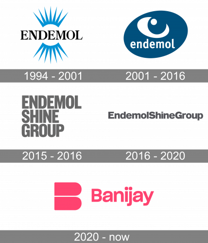
Endemol officially existed for a bit more than twenty years, from 1994 to 2015, when it was bought by another large player on the media market, Shine Group. So the visual identity history of the brand can be divided into three periods, while Endemol itself had only one major redesign of the emblem, held in 2001.
Initially, the company was founded as the result of the merger of two smaller tv production companies, one of them was owned by Joop van den Ende and another — by John de Mol, this is the name of the new company that was formed by the surnames of the new owners.
1994 – 2001
The initial Endemol logo was designed in 1994 and stayed untouched for almost seven years. It was a sharp and elegant badge, executed in the black, blue, and white color palette, with the uppercase serif logotype in the center of the composition. Above and under the black inscription there were two mirrored elements in blue — crow-like arched with sharp elongated rays. Each of the “crowns” featured seven rays. The composition resembled a stylized abstract eye and was kind of a hint to the purpose of the company — visual production.
2001 – 2016
The redesign of 2001 introduced the second and the last official Endemol Logo, where the eye correlation was kept but redrawn in a completely new way. The new badge featured a solid deep blue oval, which was placed diagonally, with a white lowercase “Endemol” inscription in a fancy bold typeface written under a stylized white eye, formed by a solid circle underlined by a thick arched line with sharpened ends.
Endemol Shine Group
2015 – 2016
In 2015 Endemol was acquired by the Shine group, and the Endemol Shine Group was formed. So the new logo was introduced in the same year. It was something completely different from the blue Endemol logos. The new concept was based on bold brutal lettering in medium-gray. The name of the new company was set in three levels and executed in the uppercase of a modern geometric sans-serif typeface. Although the Endemol badge from 2001 was still in use until the end of 2016.
2016 – 2020
The redesign of 2016 kept the gray and white color palette of the Endemol Shine Group but changed the disposition of the words and the typeface of the lettering. The redesign was held by the famous Pentagram bureaux, and what they did was place the three parts of the logotype in one horizontal line, with no extra spacing between the words. All three words were executed in the title case and used a more classic sans-serif typeface, which is similar to Bauhaus Akzidenz Grotesk. The letters in this font had a more rounded and sleek shape, which gave a timeless and sophisticated look to the whole badge.
Banijay
2020 – Today
In 2020 the Endemol Shine Group was acquired by Banijay Group, so the logo was replaced by the Banijay corporate emblem. The logo, created by the Moving Brands agency, is executed in a bright pink and white color palette, which evokes warm and happy feelings. The modest title case logotype in a simple sans-serif typeface, Sharp Grotesk Medium, is set under it on the left from the bold abstract emblem, which is a minimalist letter “B”, formed by two equal solid elements placed one under another.


