EMC is a short name of the Dell EMC, a computer corporation, which was established in the United States in 1979. The company specializes in providing its customers with various cloud, storage, and security services for their networks, and today it operates worldwide, being one of the most reliable firms in its field.
Meaning and history
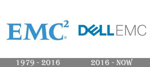
The Dell EMC visual identity was redesigned in 2016 after the name of the company was changed. Before that, there was only one version, based on the name’s ex-planation, the famous equation E=MC2, which means that energy (E) equals mass times the speed of light squared.
1979 — 2016
The original EMC logo was composed of a traditional and confident wordmark in a bold serif font with thick lines and elongated and sharp serifs. Executed in a deep and calm shade of blue, it was a representation of professionalism, values of the latest technologies and trends, expertise, and excellence in everything. The logotype, looking professional and solid, was written in a font very similar to such famous and classy fonts like Meridian Pro Bold and Frutiger Serif Pro Bold.
2016 — Today
After the name change of the company, the logo was also redrawn. Now it is a wordmark executed in two different styles, where the “Dell” part is written in its cus-tom sans-serif with the iconic diagonally laying “E”, and the “EMC” in a lightweight font in tender gray color, which makes it almost invisible and adds freshness.


