Elizalde is an automotive corporation originated in Spain, once under the helm of Arturo Elizalde. Specializing in luxury car production from 1914 to 1928, Elizalde had its operational base in Barcelona. The enterprise was notable for its rigorous attention to quality, fostering a reputation for manufacturing high-grade vehicles.
Meaning and history
Established in 1914 by Spanish entrepreneur Arturo Elizalde, Elizalde was a Barcelona-based company famed for its premium automobiles. During its operational years, 1914-1928, it gained recognition for its distinctive designs and advanced engineering, epitomizing luxury and quality. Today, Elizalde is remembered as a significant chapter in Spain’s automotive history.
What is Elizalde?
Elizalde was a Spanish luxury automobile manufacturer based in Barcelona. Operating between 1914 and 1928, the company stood as a hallmark of quality and innovation in the early automotive era.
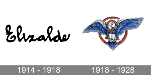
1914 – 1918
The company’s logo looked simple, yet elegant and sophisticated. It was just “Elizalde” printed in classic black. The name is printed using a cursive bold font that has the same style as Intro Script Bold or Hoolegan Script Regular. It is interesting to note that all the characters are tilted to the left. With the exception of the first letter, all the characters are interconnected, which is typical for cursive writing.
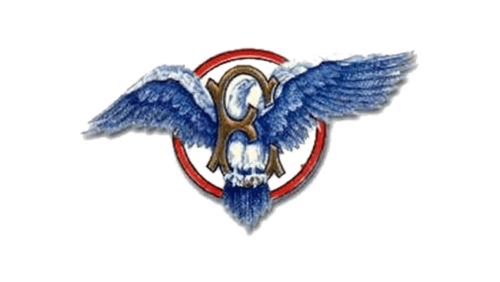
1918 – 1928
Although this logo has nothing in common with the previous one, it has the same grand, luxurious feel. The logo features an exquisite golden “E” in the center with a red ring as a frame. There is one other element that catches the attention it is a blue bird that is sitting on the lower curve of the “E” with its head peeking under the upper curve of the letter. The spread-out wings, which go beyond the ring frame, give a truly majestic and royal feel. Besides the company’s initial, there are no other inscriptions.


