Easy Hogar y Construcción is a South American chain of stores offering home improvement products and construction materials. Its parent company is Chilean Conglomerate Cencosud. The first store in Argentina started working in 1993. The following year, the company came to Chile. It was only in 2007, however, that the brand appeared on the Colombian market in collaboration with Casino Guichard-Perrachon.
Meaning and history
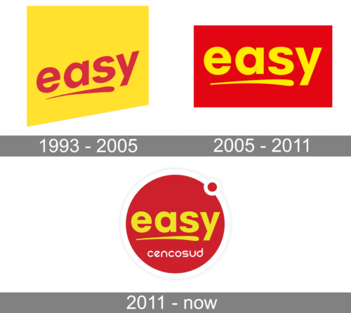
At least during the first three decades of its existence, the Easy logo had the same core.
Easy, a shortened name of Easy Hogar y Construccion is a Latin American chain of stores, which offers a wide range of products for home improvement. The chain was established at the beginning of the 1990s, and already a year after the opening of its first location in Argentina, it expanded to Chile. Today the company had more than a hundred stores in three countries of its continent: Argentine, Chile, and Columbia.
The day is a company, which tends to make home improvement works Easy for its customers, and the visual identity of the company only elevates this feeling, being friendly and smooth, relaxing, yet professional.
What is Easy
A chain of South American homecenters, Easy boasts around 160 locations. It’s a subsidiary of Cencosud S.A., which is a publicly-traded retail company and has been known as Chile’s largest retail company.
1993 – 2005
The original logo already featured the familiar combination of red and yellow. Back then, though, it was the wordmark that was red, while the background was yellow.
The name of the brand was set in a minimalist sans, and there was that recognizable single stroke below. The stroke had a bolder beginning and a lighter “tail,” due to which it brought about some motion. It can also be interpreted as a symbol of creativity. When holding a brush in our hands, we can feel we’re not confined by anything and are free to create whatever we want – some of the obvious benefits of home improvement projects.
Also, this element made an optimistic touch, as it was directed upward. This direction was supported by the wordmark, too – its beginning was noticeably lower than its end.
We can also note the unusual shape of the lower part of the logo. The design was made to resemble a price tag, something not out of context for a retailer.
2005/2006 – 2011
This logo was adopted in 2006 in Colombia and Argentina, while the stores in Chile introduced it in 2005.
The color scheme was reversed with red now dominating the design. This meant that the overall effect was more eye-catching and more aggressive.
What’s even more important, the letters preserved legibility in spite of the fact that generally light text over the dark background is harder to read than when the palette is reversed. The adequate legibility partly resulted from the fact that the wordmark was straightened – it was now oriented strictly horizontally.
Even though the Easy logo might have lost some of its upbeat and optimistic moods as a result, it also became more compact. That’s why the proportions of the background shape were changed – it was now a rectangle standing on its wide side.
2011 – present
This version is a combination of the emblem of Easy with the logo of its parent company Cencosud.
A more refined style was introduced with the wordmark placed inside a ring, the ring coming from the Cencosud logo. It was white and had a darker shade, due to which some depth was added to the previously flat design.
A tiny ring in the top right-hand part of the logo, which also comes from the logo of the parent company, might have many interpretations (apart from the fact that it’s just a visually appealing detail). One of the interpretations suggests that that’s a symbol of a full stop. In this way, the company implies it has a truly wide range of products. You’ll have to go no further – Easy is your final stop.
Colors and font
The combination of red and yellow has been one of the core elements that have connected different versions through the years.
The legibility of the Easy logo results from the wise choice of type. While it might be not very unique, it does its job well.


