DuPont is the name of one of the world’s biggest chemical companies, which was established in 1907 in the United States. The company has around 100 thousand employees and yearly revenue of almost 90 billion dollars.
Meaning and history
The DuPont visual identity is still based on the company’s logo created in 1907. The logo stayed with the brand during its history and was only modernized in 2018, yet the main principles remained the same.
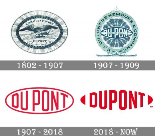
1802 – 1907
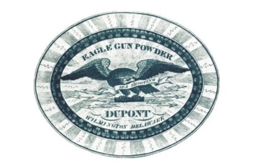
The very first DuPont logo was created in 1902 and stayed with the company for more than a century. It was a very elegant and detailed horizontally stretched oval badge in gradient light blue shades and with a thick dark blue frame, outlined by a wider and lighter one. In the middle of the badge, there was an image of an eagle with its wings spread to the sides. The badge was surrounded with the lettering: “Eagle Gun Powder” in ExtraBold serif, arched above it, and the “DuPont” in the same color and style, but with a bit larger letters and set in a strong line, under the bird.
1907 – 1909
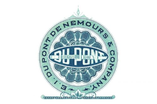
The redesign of 1907 introduced a fresher and more delightful badge, with the perfect circular shape and a light turquoise framing with blue ornaments on it. The logotype was set in a fancy and modern sans-serif font, using white color, and set on a blue horizontal oval, outlined in white. The oval was placed over a flower-like element, executed in the same color palette.
1907 – 2018
The clean lines of the geometric shape and the sans-serif typeface of the wordmark made the logo look modern and powerful.
The “Du” and “Pont” parts of the wordmark are separated by using a wider space.
2018 – Today
The DuPont logo from 2018 features the same red and white color palette and the same oval shape as the basis. But the two parts of the inscription are now written as one word and the oval framing is gone.
The lettering in a bolder sans-serif typeface just repeats the oval contour which has no outline. Though there are two arched elements placed on both sides of the wordmark, to mark the rounded angles of the oval.


