Duplo is the name of one of the Lego series, which was first introduced in 1969. This series of the world’s famous constructor toys is specialized in kits for the youngest kids and has a wide range of toys to choose from. Today Lego Duplo can be found in any toy store on the planet.
Meaning and history
Though Lego Duplo is a brand with a long history, its visual identity concept has been really constant during the years. The recognizable symbol, color palette, and smooth lines of the lettering — everything, the original logo was based on, can still be seen in the current insignia of the famous toy label.
What is Duplo?
Duplo is a label of LEGO constructors, designed for children from 1,5 to 6 years old. DUPLO appeared on the market in 1969, 37 years after the appearance of LEGO, offering constructors with larger and safer details for the little ones.
1969 – 1970
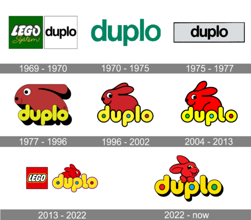
The very first Lego Duplo logo was created for the brand in 1969 and stayed in use for just several months. It was a calm and strict composition, formed by two squares — the solid green one, with the white “Lego” logotype in a black outline and a yellow cursive “System” overlapping it, and the white square in a thin black outline, where the black lowercase “Duplo” was written in a traditional sans-serif font.
1970 – 1975
The very first Duplo logo was introduced in 1969 and stayed with the brand for a bit more than five years. It was a clean lowercase lettering in a traditional sans-serif typeface, set in a calm yet the deep shade of green against a plain white background. No additional details or color accents.
1975 – 1977
The redesign of 1975 has made the Duplo badge even more laconic and strict: the green lettering turned black and got placed on a horizontally printed light gray rectangular banner in a thin black outline. The lack of color made the logo look very professional and confident, but not playful at all.
1977 – 1996
The original Duplo logo was created in 1969 and stayed with the brand for more than two decades. It was a rounded sans-serif lettering in the lowercase, executed in a bright yellow color palette and a thin black outline and a massive black shadow. The inscription was accompanied by a dark red ambler, set above it. It was a stylized image of a rabbit, drawn in profile, facing left and also outlined in black.
1996 – 2002
The redesign of 1995 refined the contours of all elements, and made the colors of the Duplo logo more delightful, though the style and concept remained untouched. The rabbit’s silhouette was now more natural, and the massive black shadow was removed from the yellow logotype. The negative space of the lowercase “D”, “P”, and “O” was replaced by the solid dots in green, blue, and red respectively.
2004 – 2013
The colors were brightened up and the contours were cleaned and modified again in 2002. The rabbit started looking friendlier and more playful, while the yellow logotype became lighter and more eye-catching. The black outline of the wordmark became thicker, which made the whole logo more visible on the colorful backgrounds of the constructor kits packaging.
2013 – 2022
The redesign of 2013 enlarged the yellow lettering, adding some gradient shades to it. The rabbit was turned to the right and now looks like it’s ready to run, waiting for a good company to play with. Another significant change of this redesign is in adding the iconic Lego emblem to the left from the Duplo insignia. With this bright and recognizable symbol the colors became even more balanced and the whole image — harmonized.
2022 – now
The redesign of 2022 has reinvented and modified the main elements of the Duplo visual identity, keeping the recognizable palette and rounded shapes. The lettering got a bolder outline and more space between the characters, while the red rabbit was completely redrawn with a bit more details on its face, and is now standing behind the letters “U” and “P”. The corporate Lego insignia was removed from the Duplo badge.
Font and color
The bold and playful lettering from the primary Duplo badge is set in the lowercase of a smooth rounded sans-serif typeface with massive letters. The closest font to the one, used in the Duplo insignia, is, probably, Clarence Inline, but with the contours slightly modified.
As for the color palette of the Duplo visual identity, it is set in yellow and red, with an addition of blue and green in the negative space of the letters. The bright shades make the logo look even more friendly and playful, perfectly showing the purpose and essence of the brand and making the heavy elements of the badge look lighter and more dynamic.


