 Duluth Trading Company Logo PNG
Duluth Trading Company is a brand of workwear and accessories operated by Duluth Holdings Inc. It was founded by Bob and Dave Fierek, but changed hands in the mid-1990s and was acquired by Fiskars. In 2000, it was purchased by Gempler’s. Gempler’s, in its turn, was sold to Lab Safety Supply three years later.
Meaning and history
While the overall structure of the Duluth Trading Company logo has remained pretty much the same, there were several subtle updates.
What is Duluth Trading Company
The Duluth Trading Company brand belongs to Duluth Holdings Inc. It has been best known for its workwear and accessories. It started from a collection for men but included a collection for women in 2005.
1987/1989 – 1993
The company was founded as Portable Products, Inc. in 1989. Its main product, which was known as Bucket Boss, was a tool organizer created two years earlier. The logo of Bucket Boss was a wordmark, where the first word was bolder and darker, whereas the second word was lighter both in terms of the weight and the color.
1993 – 2002
In 1993, the company changed its name to Duluth Trading Co. and released the first Duluth Trading Company Catalog.
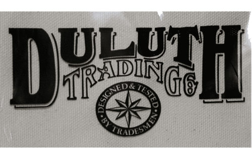
The covers of the catalog issued in 2002 and 2005 feature the logo that already looks very familiar to us. The design is dominated by the word “Duluth,” which is arched. The letters are large and somewhat heavy, with a pronounced variation in the thickness of the strokes. There are serifs with plenty of rounded and diagonal elements looking more casual than serifs in the later versions of the logo.
The glyphs in the first word are yellow, whereas the second word, “Trading,” is white or light gray depending on the background. The second word is also arched. The logo can either be flat or have shades and a thin black outline.
Below the wordmark, there was a stylized gold windrose inside a thick red ring.
2003 – 2011
The Duluth Trading Company slightly tweaked its logo. The new version can be seen, for instance, on the cover of a magazine issued in 2011 and on an archive photo of the first Duluth Trading retail store.
The word “Duluth” remained pretty much the same, with minor tweaks. Take the “U’s” – the letters have grown straighter. The modifications in the glyphs forming the second word are more obvious. The letters are bolder and more rounded. The unique character after the final “G” has disappeared.
What’s even more important, below, the lettering “Co” appeared with two symmetrical decorative elements on the left and the right.
2011 – present
The Duluth Trading Company logo became a bit more minimalist. If this logo could speak, it would probably say the same words as the brand uses to describe itself: “Tough. Functional. Comfortable.” The “tough” and “functional” part is conveyed by the heavy letters of the word “Duluth” with pronounced serifs. This time, the serifs have been straightened, and there are fewer rounded or diagonal elements.
The “L,” which used to have a very long horizontal bar, now has traditional proportions.
The glyphs in the word “Trading” have changed more notably. They have grown more compact and lighter. Also, they are now better legible. The letters “Co” became smaller.
The overall effect is neater, more functional than the previous version.
Colors and font
The palette has undergone multiple modifications. For much of its history, the company didn’t stick to a specific combination of colors but used various options. Eventually, the primary Duluth Trading Company logo became just black and white.
All the words in the wordmark feature a slightly different type. The typography is a custom one.


