The designers behind the Dsquared2 brand are Dean and Dan Caten. They are twin brothers from Willowdale, Toronto. They introduced the first men’s collection under their brand in 1995.
Meaning and history
Like quite a few other fashion houses, Dsquared2 has opted for a minimalistic logo featuring nothing but the name of the company. Even the choice of type does not tell that much about the brand.
In the Dsquared2 logo, we can see an austere sans serif typeface without any unusual features. The width of the strokes is even across all the wordmark, the letters are neither too tall nor too short (they are based on a proportional rectangle shape).
Even the color scheme – black on the white background – is the most common choice for a fashion brand. Probably the only thing in the wordmark that is not average is the weight – the type is pretty heavy.
What is Dsquared2?
Dsquared2 is a luxury Italian fashion brand producing clothes, perfumes, and accessories for men and women. The name of the brand stands for the “D” in the square, the same letter as the names of the brand’s founders: brothers Dean and Dan Caten.
Old
The original Daquared2 logo featured a stylized uppercase inscription in black, placed against a white background. The inscription had its capital letters executed in medium-thick lines, with the square contours softened, and the tail of the “Q” drawn inside, as a short vertical line in the center of the bottom line. The “2” on this badge was written in a size twice smaller than the letters.
Today
While such a logo does not tell much about the brand identity of Dsquared2, it can offer plenty of benefits crucial for any fashion house. The most important one is freedom. The logo does not set strict limits on the style of clothing the brand introduces.
While the style of the logo can be described as modern, basic, and utilitarian, it leaves enough space for the professionals designing the collections.
Emblem
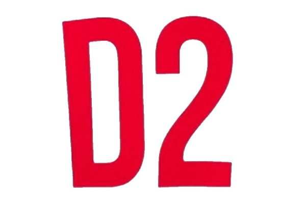
When there is not enough space for a full Dsquared2 logo, the company opts for its short version. It features the letter “D” and the number “2” using the same type as the primary wordmark.
Font and Color
The massive and stable black uppercase logotype from the primary Daquared2 badge is set in a modern sans-serif typeface with clean contours and straight cuts. The closest fonts to the one, used in the Daquared2 insignia are, probably, Europa Grotesk Nr 2 SH UltraBold and Nimbus Sans Novus D Black.
As for the color palette of the Dsquared2 visual identity, it is set in black-and-white, like most luxury fashion brands. The black color makes the modern and heavy logotype look powerful and distinctive, representing the label at its best and showing the company as a stable and confident one.


