DS is the name of a French automobile brand which was established in 2009 by Citroen and became a standalone brand in 2014. Today DS Automobiles produces electric and hybrid cars and distributes them not only across Europe but all over the globe.
Meaning and history
The car marque, created by Citroen, was meant to become a new word on the European automobile market, and in five years after its establishment, it already became a full-fledged independent brand, producing premium-class cars, which are already known all over the world for their stylish design and perfect technical characteristics.
The main feature, that makes DS Automobiles unique, is that the brand only designs and produces electric or hybrid cars, and this shows its progressiveness and environmentally-friendly approach. The brand does not just look into the future, but makes everything to bring it closer, and make all people enjoy a completely new driving experience — a high-quality and economic one, which does not harm the earth.
The name of the marque, DS, was given to it as a celebration of Citroen DS, a model, presented by Citroen in 1955. It was a car, innovative from all sides, and became a symbol of the “future”.
2009 – 2019
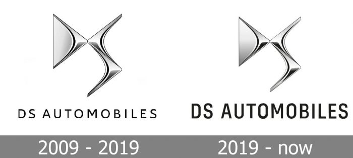
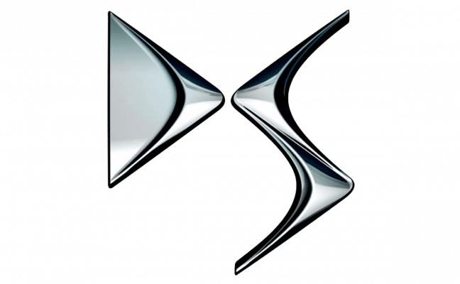
The very first logo for DS was introduced in 2009 and stayed with the brand until 2019, even though it stopped being a subsidiary of Citroen in 2014. It was a three-dimensional badge placed above the inscription in the classy sans-serif typeface. The badge was executed in glossy silver with light gradient shades and depicted two stylized letters, touching each other in the middle point.
The “D” was composed of a thin gray element with an arrow-like right part, which was emboldened and brightened up. As for the “S” it had its contours stretched vertically and looked like a mirrored image of the “D” but without the thin gray body, and with its line elongated to the bottom and curved to the left.
The wordmark “DS Automobiles” was set in the uppercase and executed in a lightweight yet solid and strict sans-serif typeface, where all black letters were neat, balanced, and had a lot of space inside and between them.
2019 – Today
The DS Automobiles logo was redesigned in 2019, keeping the main elements in their place, and just slightly refining their contours. The iconic glossy emblem became a bit smaller and more elegant, getting its contours cleaned and color elevated. As for the main change — it was about the brand’s nameplate. The lettering was still set in all capitals, but the typeface was switched to a bolder and narrower sans-serif, which gave a more stable and powerful look to the badge. Now with this new font, the logo is brighter and more intense, showing the DS marque as a confident and progressive one.
Font and color
The first DS lettering, introduced in 209, was executed in a very delicate modern sans-serif, which was very similar to such fonts as Rival Sans Regular and Arkit Regular, with smooth lines and rounded full shapes of the letters.
After the redesign of 2019, the typeface of the DS logotype was dramatically changed. Though it is still written in a sans-serif, the lettering has a completely different mood and style. The new font has narrowed bold shapes and looks close to Config Condensed Medium and Althawra Fikra Bold types, which boast thick yet neat lines and active yet cool character.
The color palette of the DD visual identity is based on silver-gray and black. The gray on the logo is introduced in two versions — glossy and mate, and this combination makes it look sophisticated and timeless, while the black lettering as an underline adds a touch of professionalism and progressiveness.
The silver metallic badge looks luxurious and fancy on car grills and bonnets no matter which color the car is, it is a brilliant addition, which is eye-catching, memorable, and fine.


