The logo of the fabric softener Downy (Lenor) has been modified at least five times since 1960.
Meaning and history
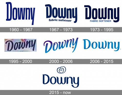
Downy, also known as Lenor in Europe, Russia, and Japan, is a laundry conditioner brand manufactured by Procter & Gamble. The visual identity and product compositions for both brands are completely the same.
The Lenor brand produces laundry conditioners that are popular in many countries around the world. In the U.S. the products are sold since 1961 under the brand name Downy. In Europe, the Lenor softeners were introduced two years later, in 1963.
The Downy range includes such product categories as laundry liquids, laundry conditioners, powders, and fragrant rinses, including the ones for sensitive skin.
What is Downy?
Downy is the name of one of the Procter & Gamble brands, which was established in 1960. The fabric softener for washing machines is also known under the Lenor label in Europe, Russia, and Japan.
1960 – 1967
The original Downy logo was black and featured a pretty heavy and generic type. The initial, the “D,” was uppercased, while all the other letters were lowercase.
1967 – 1973
It’s a similar design to the one before: the name wordmark, written in blue letters (now much darker). The difference is in the font. They assumed a rounded, wavy and flexible look, contrary to the previous strict appearance. These letters didn’t even sit at the same level, technically. They also added the words ‘fabric softener’ beneath, in a similar style, but in much smaller characters.
1973 – 1995
The redesigned logotype also changed its color to dark blue, which made it look softer. The thin white outline of the smooth sans-serif letters made them look cleaner and brighter on the light gradient background of the products’ packaging.
1995 – 2000
The generic type was replaced by a more unusual one. It had a laid-back, carefree style.
2000 – 2006
The slight upward angle, which was already present in the previous design, grew a little more obvious.
2006 – 2015
The redesign of 2006 lightened and softened the blue gradient palette o the elegant inscription, which now was set in a straight horizontal line. The letters got more rounded and neat, which turned the whole logo into somewhat kind and friendly, perfectly reflecting the “softening” side of the brand’s products.
2015 – Today
The graphical element on the Downy badge resembles a rose but also represents the washing cycle, hence reflecting the purpose of the company’s products. The thin lines of the Downy rose are supported by the medium-thick bars of the rounded sans-serif letters, set in the same dark blue color, under the emblem.
Font and color
Even though the new version of the Downy logo got a graphical addition, the wordmark is still the main element of the brand’s visual identity. The Downy lettering is set in a title case of a smooth custom cursive, with is a bit close in letter shapes to a commercial font called Hybi5 Bold, but the contours of the Downy logotype are cleaner and more distinctive, and the lines of some letters are longer.
As for the color palette of the Downy logo, it is based on the dark and deep shade of blue, which was used for one of the first versions of the logo, back in the 1970s. This is the color of quality, reliability, and freshness, a perfect meaningful combination for the products of the brand.


