Dodge brand is one of the most famous brands, focused on creating cars for followers of conservatism and aristocrats. However, Dodge is the brand which has changed the logo in the course of the years many times, – and not slightly, but completely.
Meaning and history
Dodge is an iconic American car marque, which was founded in 1900 by the Dodge brothers to produce car components. Already in 1914,the company began the production of its cars. In 1928 Dodge was sold to Chrysler Corporation, which owns it to this day. Interestingly, John and Horace Dodgy were the first co-owners of Ford, so the brothers began a new business as professionals in the automotive industry.
Today under the Dodge brand are produced cars, pickup trucks, SUVs, and commercial vehicles, which are distributed all over the globe, but still, most Dodge vehicles are sold in North America.
1910 – 1914
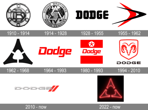
The first Dodge logo was developed in 1910 and lasted the longest period of time. It represented a stylize bearing, within which monogamy DB was placed (Dodge Brothers), also industrial stylish.
1914 – 1928
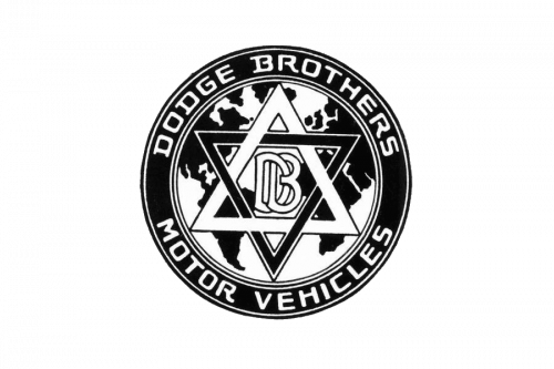
The first redesign of the Dodge visual identity was held in 1914, and the new emblem was composed of a monochrome circular emblem, where the central part was taken by the Magen David symbol set on a black and white map background. The DB lettering was set in the very middle of the badge, executed in white and outlined in black. The main lettering in the uppercase sans-serif was set in white around the black circular frame.
1928 – 1955
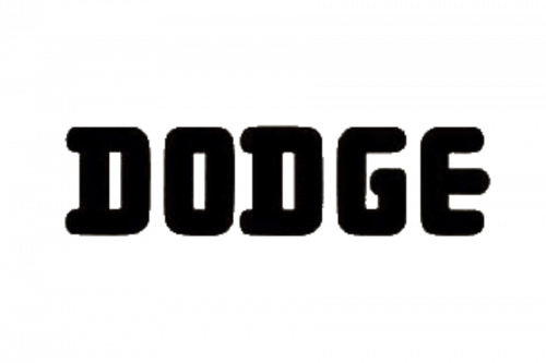
In 1928 the Dodge logo was simplified to just an uppercase inscription in a narrowed rounded serif typeface, with the letters executed in very thick and stable lines. It was a simple yet powerful emblem in a classic and timeless color palette.
1955 – 1962
In 1955, the logo was changed – instead of bronze monochrome solution blue and red shapes appeared, strongly reminded space satellite. May be said that idea was about two triangles, without the inner (this feature made figures dynamic), or about two rotated right from the audience “birds”. The symbolic of such logo was obvious – speed, focus on the future and at the same time reliability.
1962 – 1968
In 1962, Dodge logo became monochrome again, but this time – silver-blue. That time the foundation of logo became three “angles of triangles” which were divorced from each other. Formally, the logo turned into the most stable figure – triangle, but the free space inside it added dynamics and freedom to the logo.
1964 – 1993
In 1964 the brand starts using a scarlet-red logotype, executed in a title case of a modern custom sans-serif typeface with its slanted letters having their contours open, which added a sense of progress and lightness.
1980 – 1993
In 1980 the image had changed abruptly one more time. Now it was double pentagram (external – filling with red color, internal star, inserted inside external – white).
1994 – 2010
1994 year became extremely important for the brand – stylish ram head appeared on the logo, which is still associated with this brand. The main color was still red, but also the print of brand’s name appeared: as the color of font was selected a classic black.
2010 – Today
In 2010, the main Dodge logo turned into silvery font of the brand, culminating in two red lines arranged diagonally. However, “ram” remained a symbol of the brand even nowadays.
There are a lot of jokes according to the current brand symbol and the recent main image of the logo. So, often bloggers show the undoubted similarity of the stylized image of the ram and the stylized image of the female reproductive system. Report goes that it was these jokes, to the fact that the ram disappeared from the official logo of the company.
2022 – now
The redesign of 2022 has introduced a new logo for the Dodge brand. It is fully based on the geometric logo, which has been in use by the company since the 1960s, but this time the three elements, which form a triangular figure, are drawn outlined in neon red and placed on a solid black background. The new badge looks very mysterious and powerful. Reflecting the growth of the brand and its progress.
Symbol
Since 1994 stylish ram head is a symbol of the brand. Partly the talking is about the sign of the zodiac – Aries – that, according to corporate legend, was a kind of talisman of the Dodge brothers. In part because of the conservatism of the brand, preserving their traditions, as they say, with mutter persistence. And one of such traditions, extremely valuable for the brand, is the preservation and maintenance of car safety.
Emblem
Modern emblem of Dodge focus on name of the brand. The diagonal lines emphasize the name and give the feeling of up direction. After all, lines can be seen as stylish road dividing line.
Font and Color
 The stylized extended uppercase logotype from the primary Dodge badge is set in a bold futuristic sans-serif typeface with the letters stretched yet still looking balanced and stable. The closest font to the one, used in the Dodge insignia, is, probably, Ordin Rounded, but with the contours slightly modified.
As for the color palette of the Dodge visual identity, it is based on a combination of silver metallic and red, two contrasting shades, standing for power and passion, strength and professionalism, style and progressiveness.


