

![]() Doctor Who Logo PNG
Doctor Who Logo PNG
The logo of the long-running British sci-fi show Doctor Who has gone through numerous updates since 1963, when its first version was introduced.
What is the symbol on the TARDIS?
TARDIS stands for the “Time And Relative Dimension In Space”, the doctor’s spaceship. The TARDIS of Doctor Who has the shape and appearance of the Police Box. Such blue boxes were used in Great Britain as spots, where people could contact the police. The TARDIS in the tv-show looks the same as the historical boxes and has an uppercase white inscription written on top of it.
Meaning and history
![]()
The science-fiction drama series made by the BBC told the story of a time-traveling humanoid alien. Since the first episode, “the Doctor” has been portrayed by fourteen different actors.
What is Doctor Who?
Doctor Who is the world’s longest-running sci-fi series, the first episode of which came out in 1963. The main character of the show is a time and space-traveling alien humanoid, an eccentric scientist from a distant planet. His name remains unknown, but his friends call him Doctor and Time Lord.
1963 – 1967
![]()
In spite of its simplicity, the original Doctor Who logo was very successful in creating a sinister atmosphere. It filled you with the anticipation of something supernatural coming from the night sky. The white letters were semi-transparent, which created a “ghost” effect. The “ghost” feeling was but emphasized by the white shapes on the background.
The lettering was given in the font Grotesque One Three. While the word “who” was much taller than “doctor,” its width was the same. The last time this version was used was in 1967 (the beginning of The Moonbase).
1967 – 1970
![]()
Unveiled in Patrick Troughton’s fifth serial, The Macra Terror (1967), this emblem survived for the rest of the Second Doctor’s era. The “ghost” effect was still perceptible due to the combination of the semi-transparent white and black. The sans serif type was replaced by the Times New Roman font. Once again, the two words were of the same width but different height.
1970 – 1973
![]()
The striking update was based on the contrast between black and luminescent cyan. The logo was in use throughout the Third Doctor’s era. It was developed specifically for the first episode of the series broadcast in color. Yet, the fantastic color contrast wasn’t the only upgrade. Eventually, the typography grew much more unique and recognizable. The generic Times New Roman font was replaced by a bolder type with several irregular elements. Because of them, the letters looked somewhat distorted.
1973 – 1980
![]()
The following episodes featured a much more muted emblem, which was nicknamed the “diamond logo”. It debuted in the first episode featuring Sarah Jane Smith, The Time Warrior.
The insignia looked a bit like a led signboard. The light letters of the arched word “doctor” and the outline of the word “Who” contrasted the indigo filling. A bluish square could be seen in the background. While there was some playing around with the tints, the logo was typically dominated by shades of blue. In some situations, a version without the square on the background was used.
1980 – 1984
![]()
The new version resembled a led signboard even more. The letter outlines grew brighter, while the background became darker, it now featured the night sky. First used in The Leisure Hive, the logo could be seen during all the Fifth Doctor’s era.
1984 – 1986
![]()
The update was comparatively subtle. The color of the led outline grew somewhat more saturated. It now was purplish, which fit the “star-field” title sequence perfectly well.
1987 – 1989
![]()
A completely new Doctor Who logo was developed for the Seventh Doctor episodes. The huge, bold purple “Who” in block capitals was complemented by the “handwritten” word “Doctor” in yellow.
1996
![]()
This one was inspired by the iconic logo of 1970-1973. There was more depth now, while the letters featured shades of blue.
2005 – 2006
![]()
The first story featuring the Ninth Doctor started a completely new era in the history of the Doctor Who logo. This time, the lettering, which grew much thinner, was placed inside a shield. The shape of the shield resembled an eye or a UFO. It was the first time when the two words were positioned horizontally, within a single line. Over 10 versions of this emblem were used. They preserved the overall shape, yet played with the colors.
2006 – 2010
![]()
This logo followed the Doctor’s adventures since the series 2 through series 5. It has the same eye-like foundation with multiple fiery effects inside it. This time, though, the background is usually red.
2010 – 2012
![]()
This version can be broken down into two parts: the “DW” emblem and the lettering “Doctor Who.” The shape of the “DW” emblem is clearly linked with the TARDIS, the time-traveling space ship appearing as a blue police box.
2012
![]()
This edition is the first version of the logo for the series 7, and it was scrapped soon after. The designs were used by the final version, however. The show’s name here is written with tall, bulky letters with miniscule serifs here and there. They are brown and look like dead LED letter lights. Below, there was the usual BBC logo.
The background was usually brightly yellow with red.
2012 – 2013
![]()
While the type featured for the “Doctor Who” lettering remained essentially the same, the “DW” emblem disappeared. The designers experimented with the colors of the insignia and the background throughout the following episodes.
2014 – 2018
![]()
The calmer bluish design introduced in the “Deep Breath” story was based on the same typography. It looked different, though, due to the thin round shapes.
2018 – 2021
![]()
The glyphs have grown thinner, while their shape became more recognizable, partly due to the horizontal strokes on the “D,” “H,” and “O.” The emblem was developed by the design agency Little Hawk.
2021 – 2022
![]()
The redesign of 2021 has cleaned up the contours of the characters in the stylized inscription, introduced in 2018, with the letters slightly enlarged and placed a bit further from each other, letting more air into the banner. The corporate BBC insignia, placed on top of the badge, was also enlarged, but not much.
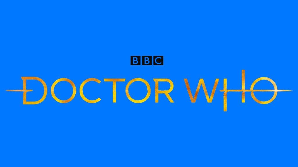
2022 – Today
![]()
In 2022 the Doctor Who logo gets completely changed. The new concept is built around a shield-shaped badge in the bright and deep shade of blue, with the gray “Doctor” arched in the uppercase along the banner, placed on top of the shield, and the enlarged “Who” set in the center of the crest, and outlined in glowing yellow, which creates a strong contrast and makes the badge look vivid and dynamic.
Font
The two earliest versions of the Doctor Who logo featured the fonts Grotesque One Three and Times New Roman. The typography of the following versions has been more unique. Eventually, the 2018 logo is based on a customized version of the Gotham typeface
Colors
The original black-and-white logos were replaced by color versions in 1970. Since then, there has been a lot of playing around with the palette.
Who designed the Doctor Who logo?
The original logo, used by the Doctor Who show from 1987 — 1989, was designed by a famous American graphics designer Oliver Elmes, who worked with different BBC projects. As for the current Doctor Who logo, introduced in 2018, it was designed by the Little Hawk Studio.
Is the Doctor’s name John Smith?
John Smith is the name of the tenth doctor. This identity was used by the character while he was hiding from the Family of Blood.
What font is Doctor Who?
The lettering on the primary badge of the Doctor Who tv show is set in the uppercase of a custom sans-serif typeface with clean contours and some of the bars elongated. The closest fonts to the one, used in this insignia, are, probably, Lemon Milk Pro Light, or Meroche Medium, with some visible modifications.


