Dickies is a denim fashion brand, which was established in 1922 in the USA. The company became famous due to its jeans and overalls and today still produces iconic designs.
Meaning and history
The Dickies logo is bright and reflects the energetic and progressive brand, which is brave and individual. The four colors of the brand’s palette celebrate power, passion, and creativity, as well as represent the reliable company, which values quality.
The Dickies logo makes the brand stand out, it is a memorable design of the visual identity, which looks good and eye-catching wherever it is placed on.
1920 – 1930’s
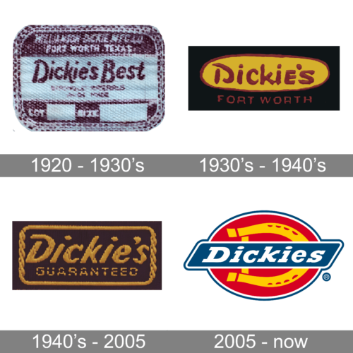
The first logo exudes a vintage aura, reminiscent of the 1920s period. It’s crafted on what seems to be textured, which brings out the rich history and craftsmanship of that era. The logo prominently features the words “Dickie’s Best” in a bold, cursive script. The word ‘Dickie’s’ stands out in an indigo hue, while the word ‘Best’ is more subdued in a sky-blue tone. The texture of the background is granulated, with varying shades of crimson, creating a contrast that allows the text to pop. Small intricacies, such as the light stitching running horizontally below the brand name and the rustic wear-and-tear, add to its authenticity. This logo transports its viewers back in time, highlighting a period of quality craftsmanship and attention to detail.
1930’s – 1940’s
This second logo exudes boldness and warmth. Set against a pitch-black backdrop, it features a vibrant oval, painted in a sunflower-yellow hue, creating a stark contrast that instantly catches the eye. Within this oval, the brand name “Dickie’s” is confidently displayed in a rustic red hue. The letters are hand-painted, with uneven edges and brush strokes evident, adding to its handcrafted charm. Beneath the brand name, “FORT WORTH” is inscribed in smaller, yet equally bold letters. The choice of red over yellow brings to mind the vibrant sunsets of the era, invoking feelings of nostalgia. The entire design is raw and unrefined, capturing the spirit of the 1930s, a time when personal touch and craftsmanship were of paramount importance.
1940’s – 2005
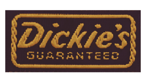
The logo captured in the photo presents a nostalgic and vintage aura, reminiscent of the designs from the 1940s. Etched against a deep, contrasting background, the word “Dickies” dominates the design in a bold, curvilinear script. Each character seems hand-drawn, with distinctive thick and thin strokes, manifesting the meticulous craftsmanship of logo designs from that era. The letters are not just mere typographic symbols; they carry with them a historical weight, an ode to the times when logos were more than branding – they were an art form.
Around the name is an intricately designed border, adding an ornamental touch to the overall design. This border, with its rope-like twists and curls, evokes a sense of ruggedness and durability, perhaps hinting at the quality and reliability of the products associated with the brand. Beneath the brand name, the word “Guaranteed” is prominently displayed, reinforcing the brand’s commitment to quality and customer satisfaction. This affirmation is a powerful statement, especially during the 1940s, a time when trust in a brand’s promise was paramount.
In sum, the logo paints a picture of a bygone era – a time when attention to detail, artistry, and a brand’s pledge were intricately woven into its identity. The design, with its vintage charm, stands as a testament to the rich heritage of the brand and evokes feelings of trust and dependability.
2005 – now
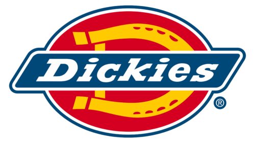
The Dickies logo is colorful and recognizable. It is composed of a bright oval with a parallelogram containing a wordmark.
The oval features a red background with a rounded yellow buckle image, which also looks like a horseshoe, placed horizontally.
The blue parallelogram has a white outline which is balanced by the white inscription. The italicized wordmark is written in an elegant and bold serif typeface and adds dynamics and movement to the logo due to its inclination.


