Distribuidora Internacional de Alimentación, S.A. is an international hard-discount supermarket chain headquartered in Las Rozas, Spain. The chain started in Spain in 1979. Its parent company is LetterOne. As of late 2020, the number of stores exceeds 6,620 (according to the company’s official website.
Meaning and history
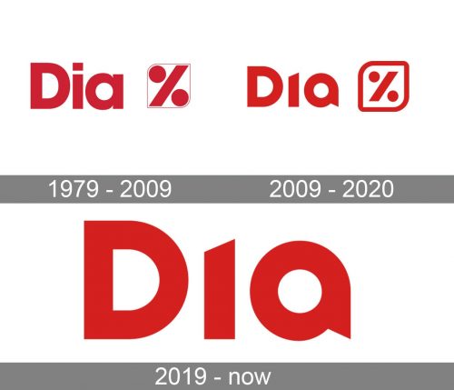
If you haven’t pay special attention to how the Dia logo looked at different moments of its history, you could probably suppose that it remained unchanged. Yet, a side-by-side comparison shows that there have been several alterations. Although they didn’t affect the overall look of the logo, they made it more modern, refined, and unique.
What is Dia?
Dia is a chain of supermarkets that was established in Spain in 1979 with its first store in Madrid. Today the chain has over six thousand stores throughout Spain, France, Portugal, Turkey, Argentina, Brazil, and China. Dia offers such products as food drinks and some household goods, — everything that local people might need.
1979
The company’s original logo already featured the bright red name of the chain in a simple sans serif type. Next to it, there was a stylized “percent” sign inside a rectangle with two rounded corners.
2009
While the “D” looked the same, the other two glyphs were slightly modified. The square replacing the dot above the “i” disappeared altogether. The “a” adopted a softer, rounded shape. The top right end disappeared, while in the lower end, the rectangle was replaced by a triangular shape.
The percent symbol grew smoother and cleaner. The widths of the border and the diagonal line became closer, and the circles became smaller. Due to this, there was now more balance in the symbol. We should also point out that this version was used in Brazil and Spain since 2019 and 2020 respectively.
2019 – Today
The “D” seems almost unchanged, except for the rounded corners – by the way, the corners have been rounded on all the glyphs. The “i” adopted an unusual “dot” (it is rather an irregular quadrilateral). The most notable modification, however, took place in the “A” – the lowercase letter was replaced by an uppercase one.
Font and color
The Día logotype is set in a designer sans-serif font, which was created exclusively for the retail chain. The sharp diagonal cut of the “I” and a sense of a dot above it, a triangular tail of the “A” pointing down, — these features make the inscription instantly recognizable. Although the custom typeface of the Día visual identity is somewhat close to Yaro Cut Black, a modern and cool sans-serif font.
As for the color palette of the Día visual identity, it uses red as the main and the only color of the badge. And for Día red is not just power and energy, but also love and care about its customers and willingness to bring warmth and comfort to their homes.


