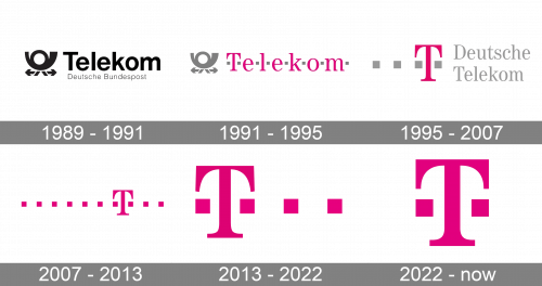
While the Deutsche Telekom logo has gone a long way since it was first introduced, each of the modifications was more like part of an evolution than a revolution.
Meaning and history

Deutsche Telecom was established in 1995, and by today has grown to the largest in its field company in Europe, and the third-largest in the world. The largest shareholder of the company is the German government, controlling 15% of the shares, the rest are in free float.
The company provides fixed and mobile phone communications, Internet access, and related services in 50 countries. The main regions of development: are Central and Eastern Europe, India and China, the United States and Canada, Brazil, and Argentina. Deutsche Telekom also owns many assets in various international companies.
What is Deutsche Telecom?
Deutsche Telecom is the largest European company in telecommunications, which was established in Germany in 1995. The company, headquartered in Bonn, provides such services as mobile phones, fixed-line phones, digital TV and media, IT, and broadband.
1989 – 1991
The original logo was dominated by the word “Telekom” in an unpretentious sans. Only the initial was capitalized. To the left, there was a stylized horn, which also resembled a human figure due to the two “legs” and arrows below. Under the name of the company, you could see the writing “Deutsche Bundespost” in tiny letters.
1991 – 1995
The horn grew gray, while the word “Telekom” was colored pink. A couple of gray dots appeared from both sides of each of the glyphs. This dot theme symbolizing communication has been present in the logo ever since.
1995 – 2007
Now, the centerpiece of the design was a large pink “T” surrounded with four tiny squares, which had replaced the dots. To the right, the lettering “Deutsche Telekom” in a classic serif type could be seen.
2007 – 2013
The name of the company disappeared leaving only the “T” and the squares. The number of squares reached ten. All the elements of the logo were now pink.
2013 – 2022
The design team behind the Deutsche Telekom logo has decided to reduce the number of squares to four. Now, the “T” is placed between the first two of them. The letter still features the same shape and has serifs. In addition to the primary logo, there is also a version where the words “Deutsche Telekom Group” in gray are added.
2022 – now

The redesign of 2022 has introduced the most laconic badge ever used by the German company. The logo is now composed of the capital “T” in solid fuchsia pink, with two square dots on its sides. The shapes of all elements fully repeat the first part of the previous logo, designed in 2013, but now it looks more balanced and stable.


