The “d” dominating the logo of Deuter bears a double meaning. On the one hand, it is the initial of the word “Deuter,” on the other, it symbolizes the brand’s best-known product.
Meaning and history
The centerpiece of the Deuter logo is a double lowercase “d.” The first “d” is positioned in the forefront, while the second “d” is placed behind and slightly to the right. It looks like the shade of the first “d.” The similarity with the shade is reinforced by the colors: the color of the “background” “d” is typically lighter than that of the letter placed at the forefront.
What is more important, the glyph is not just the initial of the company’s name but also the symbol of its core product, the backpack.
The name of the brand can be seen below. It features a friendly sans with playful glyphs. The letters have rounded ends and corners. The most unusual glyphs are probably the “e’s” with their unfinished shape.
The “d” and the wordmark are placed inside a trapezium with rounded corners. However, you can often come across a Deuter logo without the trapezium.
1919 — 1985
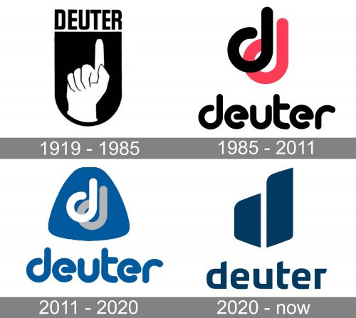
Around a hundred years ago, the company used a logo showcasing a hand pointing up, at the “Deuter” wordmark. The old wordmark used a simple all-caps sans. The design was placed inside a shield.
1985 — 2011

The redesign of 1985 introduced a modern and progressive logo for Deuter. It was a lowercase black inscription in an extra-bold sans-serif typeface with rounded open contour letters. The wordmark was placed under a “DD” monogram, also in the lowercase. With the black “D” overlapping a light pink one. Both symbols of the monogram featured the same size and style as the letters of the logotype.
2011 — 2020

In 2011 the color palette of the Deuter visual identity was switched to a calmer one. The new concept was built around dark blue colors with white and gray elements, which made the badge look professional and evoked a sense of confidence and high quality. The “DD” monogram in white and gray was now placed on a solid blue crest on the left from the rounded extra-bold inscription in a slightly modified sans-serif typeface.
2020 — Today

The redesign of 2020 introduced a completely new Deuter badge, in a new darker blue shade and with the new symbols. The lettering was completely changed, and even though it was still written in the uppercase, the new typeface made it look sharper and stronger. As for the emblem, the monogram was gone, and the new abstract badge appeared in its place. Composed of two solid blue segments it added power and influence to the overall mood of the Deuter logo.


