Gymshark produces not just sportswear, but special items for fitness enthusiasts that help advantageously demonstrate the results of training – muscle definition and a beautifully toned figure. If major sports brands try to cover a wide audience of consumers engaged in sports, Gymshark is focused on real fitness fans. But in addition to its narrow specialization, the brand is also known for its history.
Meaning and history
In 2012, nineteen-year-old Ben Francis and his friends were passionate about going to the gym and saw this as a promising niche for making money. First, a fitness application was launched, and later a virtual sports nutrition store and the friends decided to add sportswear as well, which they planned to resell from other resources. But they couldn’t find a firm that would meet their needs. So they started to make the jerseys themselves.
The point is that Ben and his team wanted to sell clothes for a special segment of athletes – bodybuilders. And the major manufacturers of sporting goods offer excellent products, but all of them are designed for the standard parameters of people of average build. And what about those who have huge amounts of muscle? Now they can buy clothes at Gymshark!
The founder of the brand, Ben Francis, was himself a regular weightlifter, hence the understanding of the relevance of the problem.
Starting with athletic shirts, today Gymshark sells dozens of different items, including swim shorts and swimwear.
The company sponsors popular Youtube-, Instagram-, fitness-, and HGH bloggers. The total number of subscribers of all brand ambassadors exceeds 20 million people.
What is Gymshark?
Gymshark is the name of a fashion brand of sportswear founded by Ben Francis, a 19-year-old Englishman, in 2012. Today Gymshark is one of the most successful start-ups in the world, with annual revenues of over two hundred million dollars. The clothes of this brand are advertised by fitness and bodybuilding stars, and the number of subscribers on Instagram exceeds four million people.
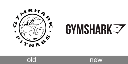
In terms of visual identity, since the day of the brand’s foundation and by 2023, the company has only redesigned its logo once, making it sharper and stronger, and adding a unique touch, showing the Gymshark character and philosophy.
Old
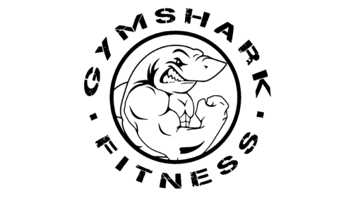
The first Gymshark logo, designed in 2012, was composed of a graphical emblem as a central element, and a bold stencil lettering written around it. The emblem featured a white roundel in a black outline, with a caricature of a bodybuilding with the head of a shark, drawn on it in black contours. It was a memorable and funny badge, which also evoked a sense of power and looked quite aggressive and brutal.
New
The redesign of the Gymshark badge has introduced a completely different concept. The new logo of the brand is composed of a bold uppercase wordmark, followed by a small stylized emblem, which depicts a geometric head of a shark, turned to the right. The simple shapes of the inscription balance the edgy and sharp contours of the emblem, making up a very harmonious yet still stable and strong logo.
Font and color
The bold and narrowed lettering from the primary Gymshark logo is set in the uppercase of a geometric sans-serif typeface, which is pretty close to such fonts as Bebas Neue, or Corner Deli T, with some modifications of the characters’ contours.
As for the color palette of the Gymshark visual identity, it is based on a classy combination of black and white, which not only always looks actual and elegant, but also brilliantly reflects the purpose of the brand and its “heavyweight” segment.


