Diadora is n Italian brand is sportswear and accessories, which was launched in 1948 by Marcello Danieli. The company is famous for its sneakers, which are loved by many celebrities. Brand is well-known worldwide and has its subsidiaries on all the continents.
Meaning and history
The brand’s name is translated from Greek as “sharing gifts”, which reflects the brand’s philosophy of giving their customers the best possible designs and the highest quality.
The Diadora logo is composed of a graphical representation of the brand’s name. It is a unique and uncommon style of lettering with a small brand’s emblem above the letter “O”.
The Diadora nameplate is written in all the lover case letters and features an interesting typeface, with thin contour lines and filled spaces inside the letters. It looks like the logo consists of five solid black circles with straight fine lines coming out of them.
What is Diadora?
Diadora is a famous Italian brand of sportswear and footwear, which was established in 1948. The company has its products sold worldwide, via physical and online stores. Today Diadora also produces uniforms and shoes for the Italian Association of Sports Referees.
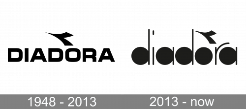
1948 – 2013
The original Diadora logo, designed in 1948, stayed with the company for more than sixty years, which is pretty impressive. It was a bold uppercase inscription in a modern and heavy sans-serif typeface, with a horizontally oriented stylish tick placed above the letter “O”. The tick had its thin sharp line pointing a bit diagonally, up, and left, creating a sense of motion and speed.
2013 – Today

The Diadora emblem is a geometrically styled V-like bird’s silhouette, which reflects the brand’s free spirit and moving forward.

The Diadora logo is instantly recognizable, it shows the brand’s expertise in design, its creativity and rich heritage.
Font and Color
The iconic lowercase Diadora logotype from the official badge of the Italian sportswear brand is set in a custom sans-serif typeface with the rounded letters having their negative space in solid black. The straight bars, complementing the black stickers are set in medium-weight lines with the ends softened.
As for the color palette of the Diadora visual identity, it is set in black-and-white, with the massive black characters evoking a sense of stability and modern style; progressiveness, and excellence.


