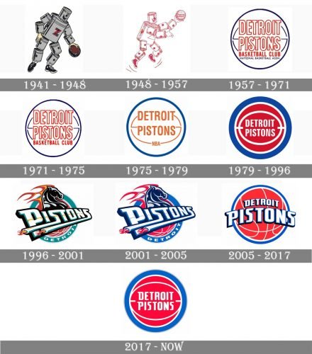
Since 1941, when the basketball teamwas established, the Detroit Pistons logo has undergone quite a few changes. However, it has always had the same basis: a basketball with the team’s name over it.
Meaning and history
The visual identity of the basketball club from Detroit, Michigan, has been very constant since 1957 when the first circular badge was designed. Though the first two versions of the emblem were completely different.
Established in the area, famous for the automaking industry, the Pistons used a caricature of a man, composed of automobile parts, as a celebration of its roots and heritage.
1941 — 1948
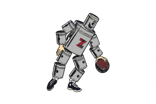
The Fort Wayne Zollverein Pistons club got its first logo designed in 1941. A funny gray and black “mechanic” man with a brown basketball had a bold red letter “Z” on his chest and looked like a comics hero. No lettering or framing, just a ball, and sneakers.
1948 — 1957
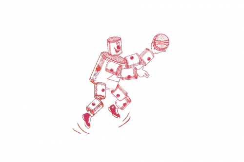
The logo was redrawn in a new white and red color palette in 1948. The image of an auto-parts man became more dynamic and fun, evoking a sense of energy, enthusiasm, and passion for basketball. This emblem stayed with the club until its relocation to Michigan.
1957 — 1971
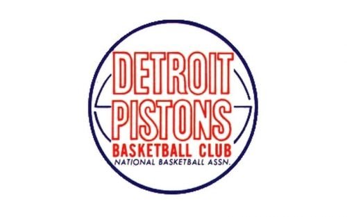
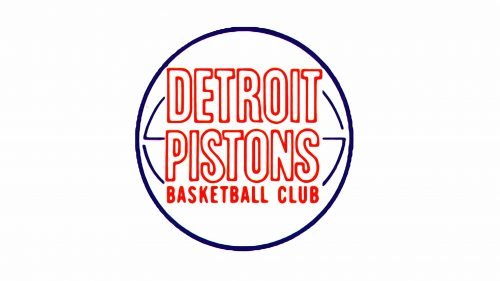
After the name of the club was changed to Detroit Pistons, the new logo was introduced in 1957. It was a simple and light circular badge, where the outlines Sans-serif inscription was placed in a white basketball with blue details and outline. The “Basketball Club” lettering was written in solid red under the main logotype, using a simple Sans-serif font.
1971 — 1975
In 1971 the bottom line of the emblem’s lettering was removed from the logo, making it cleaner and more professional. It was the dark blue italicized “National Basketball Assn.” which was gone, everything else stayed in its places until 1975.
1975 — 1979
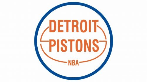
The color palette of the logo got switched to blue color white and light brown in 1975. The outlined letters became solid now and the “Basketball Club” line was replaced by the “NBA”, executed in the same style, but using smaller letters. The shade of blue became a bit lighter, which could be noticed only on the emboldened frame of the logo.
1979 — 1996
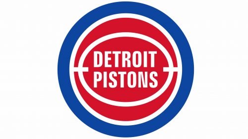
The predecessor of the logo we all can see today was introduced by the club in 1979. It was the same circular composition, but with its color palette and lines refined. Now the red basketball was enclosed in a thick blue frame and had its details executed in white, as well as the modified “Detroit Pistons” inscription in a cleaner and more modern Sans-serif typeface.
1996 — 2001
The logo from 1996 featured a new composition — it was a black horse placed above the stylized “Pistons” inscription in a fancy custom typeface with elongated lines, which had the fire on their ends. The new color palette of the club’s visual identity featured calm turquoise, red, white, and delicate yellow details.
2001 — 2005
The image remained untouched, but the color palette was changed in 2001. The new main colors of the Detroit Pistons’ visual identity became red, blue, and white again. The letters also had a slightly visible light gray stripe coming through them horizontally.
2005 — 2017
The iconic basketball badge was back in 2005. Though it used the same blue, red and white color palette, it looked slightly different from the previous versions as got more white lines on its red body. The “Pistons” inscription in a custom typeface got enlarged and arched on the ball, executed in white and outlined in intense blue.
2017 — Today
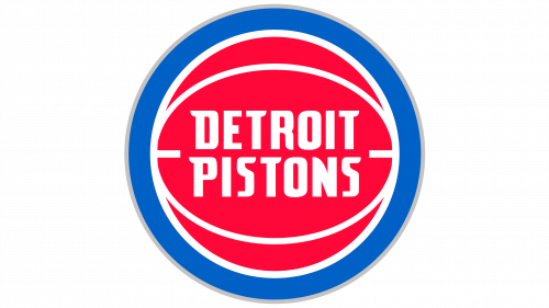
The logo design from 1979 was brought back by the club in 2017. The only thing that was changed — was the typeface of the white wordmark, which now featured smoother and sharper shapes of its Sans-serif letters, which started looking more progressive and strong than ever.
Font
Although some sources identify the font as Zurich Bold Extra Condensed BT created by Bitstream Inc., it actually does not look identical to the wordmark. According to other sources, the team did not use any of the existing fonts for its wordmark, but a custom typeface, which was specifically created for the team, based on its ’90s logo.
What does the Detroit Pistons logo mean?
The bright red, blue and white logo of the Detroit Pistons club is composed of a stylized red basketball, outlined in blue, and a two-leveled lettering with the club’s name, set in a custom sans-serif font with narrowed contours and diagonal cuts of the characters’ bars. The color palette of the badge stands for the patriotic values of the club, and its main graphical element, the ball, points to the club’s sport discipline, basketball.
Why did Detroit Pistons change logo?
The badge of the Detroit Pistons club was redesigned several times throughout the years, with the latest refinement taking place in 2017, in order to celebrate the moving of the club to a new stadium, the Little Caesar’s Arena. The redesign kept the original concept and the color palette of the badge, but redrew all elements in a modern style, representing the ability of the club to grow and change.
Are the Pistons still a team?
Yes, Detroit Pistons, a professional basketball club from Detroit, Michigan, still exists and competes in the Eastern Conference of the National Basketball Association.
Who is number 1 on the Pistons?
The most famous Number 1 player in the Pistons history was Chauncey Billups, who was recruited by the club in 2002, and left the Pistons in 2008. He returned to the club for just one season in 2013. Since he left, the club has no Number One players, and the Billups jersey was discontinued in 2016.
Colors
The team’s official palette includes the following colors: royal blue, red, chrome, navy blue, and white. The primary Detroit Pistons logo comprises all of them, except navy blue, while the icon with the letter “P” does not have any chrome elements in it.
RED
PANTONE: 186
HEX COLOR: #C8102E;
RGB: (200,16,46)
CMYK: (2,100,85,6)
ROYAL
PANTONE: 7687
HEX COLOR: #1D42BA;
RGB: (29,66,138)
CMYK: (100,78,0,18)
GRAY
PANTONE: PMS COOL GRAY 5
HEX COLOR: #BEC0C2;
RGB: (181,179,179)
CMYK: (30,25,25,0)
NAVY
PANTONE: PMS 282
HEX COLOR: #002D62;
RGB: (0,45,98)
CMYK: (100,68,0,54)


