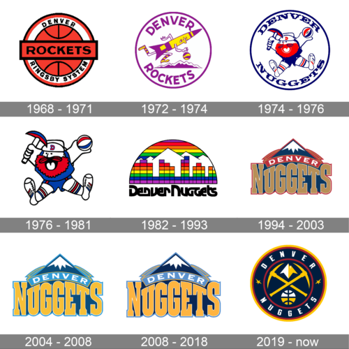
The American basketball team Denver Nuggets has gone through five distinctive logos so far. The current one has been used, with subtle modifications, since 1994.
Meaning and history
The visual identity history of the basketball club from Denver, Colorado, has always been built around two main themes — Maxie the Miner, the club’s mascot, and the mountain peaks, celebrating the motherland State of the club and its landscape.
What are Denver Nuggets?
Denver Nuggets is the name of a professional basketball club from the United States, which was established in 1967 and today is a part of the National Basketball Association. The club has Ball Arena in Denver as its home stadium and Michael Malone as the head coach.
1967 – 1971
The very first logo of the club was created right even the establishment of the team under the name Denver Rockets. It was a minimalist and clean badge with the red basketball paced on a white circle with a double black and red outline and a horizontal red banner with the bold sans-serif “Rockets” lettering on it. The “Denver Kingsby System” inscription was placed around the ball’s perimeter, on the white background.
1971 – 1974
The redesign of 1971 completely changed the Rockets’ visual identity, switching the color palette to yellow and purple and the laconic composition to a funny caricature. The colorful rocket was running with a basketball on a mountain peaks background. The wordmark was written around the circular perimeter of the emblem, in all capitals of purple sans-serif typeface.
1974 – 1976
In 1974 there was a merger of ABA and NBA, and the Rockets had to change their name to Nuggets, as there was already one team with such a name in the new league.
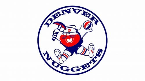
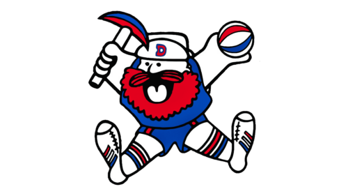
With the new name, the new logo came up in the same year. It was a funny blue, red and white image of a beard-miners who later got nicknamed Maxie the Miner. He was drawn jumping above the stylish sans-serif inscription in Ted and blue.
1976 – 1981
The Denver Nuggets logo from the end of the 1970s repeated the main element from the previous version, Maxie the Miner, drawn in exactly the same style, but with some color alternations, and the contours emboldened and cleaned up. The red on the men’s clothing and his beard got darker, which created a stronger and brighter image.
1981 – 1993
The redesign of 1981 brought a cool disco-style emblem to the club’s identity. It was a half-circle with its upper part arched from the center, executed in a rainbow palette. On the emblem, there was a Denver landscape drawn on the background of white mountain peaks. The wordmark in black used the same typeface as the one from the previous logo and was placed under the image.
1993 – 2003
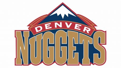
The new logo for Nuggets was introduced in 1993. It was a sleek and elegant badge with the royal blue and white mountain, a red arched banner with the white “Denver” on it, and an enlarged gold “Nuggets” inscription in a bold serif typeface, placed under the arch.
2003 – 2008
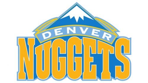
The color palette of the logo was changed in 2003. The new delightful shades of white, blue, and yellow made the whole image look brighter and fresher, evoking a sense of growth, progress, and energy of the basketball club.
2008 – 2018
The Denver Nuggets color palette got elevated again in 2008. The shades of blue and yellow became darker and more intense, and the arched banner was now executed in light blue, reflecting the cold and snow of famous Colorado maintains.
2018 – Today
In 2018 a completely new design was created for the Denver Nuggets identity. Today it is a dark blue circular badge with a white frame in a double yellow and Ted outline. Two miner hammers are crossed in the center of the badge, above a yellow and white basketball, and under the image of the mountains, and white lettering is written around its perimeter. The two parts of the inscription are separated from each other by two fancy yellow stars.
Font
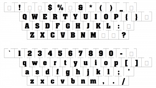
The font used for the word “Nuggets” looks fairly similar to Aachen Bold, which is a slab serif type created by Colin Brignall.
Colors
There are two shades of blue – navy blue and light blue – on the Denver Nuggets logo. The combination gives the image more dimension, while gold adds contrast. White is used as a supplementary color.
MIDNIGHT BLUE
PANTONE: PMS 289 C
HEX COLOR: #0E2240;
RGB: (13, 34, 64)
CMYK: (100, 76, 12, 70)
SUNSHINE YELLOW
PANTONE: PMS 123 C
HEX COLOR: #FEC524;
RGB: (255, 198, 39)
CMYK: (0, 24, 91, 0)
FLATIRONS RED
PANTONE: PMS 202 C
HEX COLOR: #8B2131;
RGB: (139, 35, 50)
CMYK: (29, 96, 76, 29)
SKYLINE BLUE
PANTONE: PMS 7687 C
HEX COLOR: #1D428A;
RGB: (29, 66, 138)
CMYK: (100, 86, 15, 3)


