 DeLorean Motor Company Logo PNG
The DeLorean Motor Company (DMC) is an American firm, currently owned by Stephen Wynne, primarily known for manufacturing iconic gull-winged sports cars. DMC operates from Humble, Texas, where it refurbishes original DeLorean vehicles and provides parts and services to existing owners. The DeLorean car has gained worldwide fame due to its prominent role in the “Back to the Future” film series.
Meaning and history
Founded by automotive industry executive John DeLorean in 1975, the DeLorean Motor Company (DMC) sought to redefine the sports car market. Its iconic achievement was the DMC-12, a stainless steel-bodied vehicle with distinctive gull-wing doors, made famous in the “Back to the Future” films. The company originally operated from Northern Ireland but faced bankruptcy in 1982. Stephen Wynne purchased the company name and remaining parts inventory in 1995, reviving DMC in Humble, Texas. The firm now focuses on refurbishing and servicing DeLoreans, with potential plans for new production models.
What is DeLorean Motor Company?
The DeLorean Motor Company is an American automaker, primarily known for producing the DMC-12 sports car with its unique stainless steel body and gull-wing doors. It’s presently headquartered in Humble, Texas, refurbishing original DeLorean vehicles and providing parts and services.
1975 – 1982
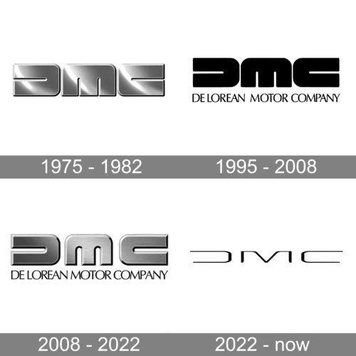
A very stylish logo was created in 1975. The logo consisted of “DMC” initials which had a shiny, metallic silver finish. The characters also had an outline that gave them volume. The most notable feature of this logo was the symmetry, which was achieved by making the slits in all the letters very minimal. This allowed to do without the horizontal bar in the “D”, making it a mirror image of the “C”.
1995 – 2008
The logo was updated 20 years after the original version was presented. The designers changed the color palette to black. They also added the full name. The inscription under the initials was printed using an Optima Pro Cyrillic Roman or a similar typeface. The letters were all uppercase but relatively small to make both lines the same width. The logo looked classic and very impressive.
2008 – 2022
The metallic silver color palette was brought back. At the same time, it was actually a mixture of the last two logos. When comparing the original and this versions, it will become obvious that the slits in the letters were made wider and the three-dimensional border became more obvious. The silver was not as shiny and had a darker shade. The company also preserved the additional line with the full name printed in black.
2022 – now
For the initials, which were the only element of the logo, the brand used a new font that was inspired by a typeface similar to Lightyear Regular. The designer used thin, elegant strokes and printed the “D” without the vertical stroke, making it a mirror image of the “C”. This created a symmetrical brand image that looked modern and minimalistic, while still reminding of the original logo.


