

![]() Death Note Logo PNG
Death Note Logo PNG
Death Note is a famous Japanese manga series, which was first released in 2003. The manga was created by Tsugumi Ohba and Takeshi Obata. It tells a story of a mysterious notebook that has magical properties and is a perfect weapon. The story goes that if you write a person’s name and signature on it, he will surely die in a short time.
Meaning and history
![]()
The anime series Death Note is based on the Japanese manga of the same name and tells the story of a mysterious notebook that can decide people’s fates. At the center of the plot lies the eternal question, of whether killing a criminal can be considered good if it might save other lives. The answers to these questions are to be found by a young schoolboy, Light Yagami, who gets hold of the Death Note.
Light’s father works as a policeman, and the boy constantly hears and sees how difficult it is to fight the guards of the law against the criminal world. He dreams of following in his father’s footsteps and becoming a police detective to root out all evil on earth.
When Light finds a unique weapon in the form of the Death Notebook, he begins to administer his justice, changing the world for the better. Writing in the notebook a person’s name and describing his description, you can soon expect his death. But the police and even Interpol are interested in strange deaths. The investigation of the mysterious deaths was taken up by an equally mysterious detective working under the pseudonym “L”.
What is Death Note?
Death Note is the name of a manga franchise, which was written by Tsugumi Ohba in 2003. The original run of the manga comics was from 2003 to 2006 and consisted of 12 volumes. Today Death Note is also a popular animated tv-series, translated into many languages.
In terms of visual identity, the famous manga is very progressive and stylish. It is based on the lettering, but some of the characters are set horizontally, which creates a unique and very interesting image, even though, it is executed in traditional shapes and uses a laconic black-and-white color palette.
2003 – 2006
![]()
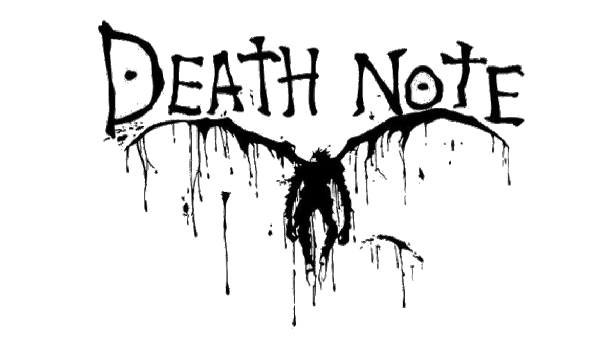
The logo, created for the Death Note franchise in 2003, is composed of black lettering, set against a plain white background, but can turn white when used on the cover of the comics, or with other colorful graphics. The inscription is set in the uppercase of a bold serif font, with the letter “E” mirrored, and the “A” with both “T”s set horizontally. The wordmark is underlined by a sharp horizontally stretched black banner with white hieroglyphics over it.
2006 – now
![]()
Font and color
The bold serif lettering from the primary scratch Note badge is set in a heavy serif font with slightly narrowed characters, designed exclusively for the franchise. The uneven contours of the letters and their stable shapes make the font of the Death Note logotype look pretty close to such types as Runner Stamp Std, or 1917 Stencil Proportional, but with significant modifications of the characters.
As for the color palette of the Death Kite visual identity, it is based on a timeless combination of black and white, which looks confident and powerful on any background, and supports the mysterious and dangerous mood of the story and its plot.


