Decode Entertainment is a renowned production company specializing in children’s television content. Originally founded in Canada, it is a division of DHX Media, which has since been rebranded as WildBrain. Strategically positioned at the intersection of creativity and market demand, Decode Entertainment has reached audiences on an international scale. Notably active in North America, Europe, and parts of Asia, the company has successfully distributed a plethora of shows and films. Their ability to produce captivating narratives and memorable characters sets them apart in the industry.
Meaning and history
Decode Entertainment was established in 1997 by industry professionals Steven DeNure, Neil Court, and John Delmage. Throughout its active years, the company has marked a significant footprint in the world of children’s television programming. With acclaimed series like “Franny’s Feet” and “The Doodlebops,” Decode Entertainment’s contribution to children’s entertainment is undeniable. Their consistent output of quality shows led to their eventual acquisition by DHX Media, now known as WildBrain, expanding their reach and influence. Currently, as a part of WildBrain, they continue to craft stories that resonate with audiences across the globe.
What is Decode Entertainment?
Decode Entertainment is a Canadian production company recognized for its children’s television content. Founded in 1997, it has produced numerous popular series and has since become a division of the media giant, WildBrain. Their work spans across continents, delighting young audiences worldwide.
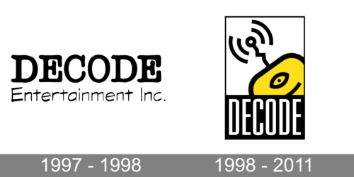
1997 – 1998
Dominating the visual space is the bold and emphatic typography of “DECODE”. The letters, appearing in a distinctive, weighty font, immediately capture attention, conveying a sense of authority and prowess. The thick black strokes are interspersed with subtle curves, striking a balance between rigidity and fluidity. Beneath it, “Entertainment Inc.” is written in a more subdued and smaller font, suggesting a subtext or elaboration to the main message. The contrast between the two fonts creates an engaging dynamic, emphasizing the primary focus on ‘decoding’—a term often associated with unraveling, understanding, or translating. The overall impression is of a company that is both assertive and innovative in the entertainment sector.
1998 – 2011
The second logo presents an intriguing fusion of imagery and typography. At the top, a stylized TV is integrated with concentric signals, evoking themes of communication, technology, and connectivity. The bright yellow of the mouse contrasts sharply with the black backdrop, ensuring it stands out, while the eye in its center could be interpreted as a nod to vigilance or discernment in the digital realm. Beneath this emblem, the word “DECODE” is spelled out in bold, block letters, echoing the assertiveness of the first logo but with a more modern touch. The juxtaposition of the graphic element with the text implies a brand that’s at the intersection of technology and discovery, decoding the digital world for its audience.


