De Película Plus is the name of a tv channel that specialized in broadcasting the most significant examples of Spanish-language cinema across all genres and periods. It has an extensive film catalog that includes black-and-white and color productions, picaresque films, movie marathons, comedy series, drama, and many more.
Meaning and history
A sun brand of one of the most famous tv companies of Latin America, De Película Plus was established in 2012, and today has its huge audience of millions of people all over Latin America, the USA, and Mexico (the motherland of the company). Thanks to its programming designed in cycles, De Película Plus covers the interests of all members of the family and the different film genres.
2012 – 2016
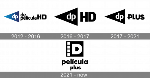
The very first logo for the tv channel was created right after its launch, in 2012. As for the first five years, the name of the channel was De Película HD, the logo was fully based on it. The original badge was composed of a gradient blue triangle, which was facing to the left and had its peak elongated. On the blue background, there was a white lowercase “DP” lettering in a smooth modern sans-serif typeface. The complete wordmark was set in the same font on the right from the emblem, in black, and followed by the uppercase “HD”. There was also a shortened version, with just the “HD” lettering after the triangle.
2016 – 2017
The redesign of 2016 made the shortened version of the logo the only one and redrew it in a flat black-and-white color palette. The typeface of both “DP” and “HD” parts was changed, but only a bit. The abbreviation from the triangle got its contours a bit wider and the lines — thinner, while the black “HD” became taller and started looking more massive, yet at the same time — stable and professional. This version of the logo was in use for just a few months, until the rebranding of the channel into De Película Plus.
2017 – 2021
With the new name, the new logo was created in 2017. The only difference with the previous version was in the lettering after the black triangle with the white “DP” on it. The bold and stable uppercase “HD” was replaced by the cool and modern “Plus”, also in the uppercase, but in a different font, with the horizontal bar of the “P” elongated to the left.
2021 – Today
Something new was adopted for the De Película Plus visual identity in 2021. Only the black and white color palette remained unchanged. The solid black square with four white squares in the smaller size, set vertically along the left side, had a bold capital “D” in white set in the center. The letter featured thick lines and clean contour with no serifs. The square emblem was underlined by the inscription in two levels, the lowercase “Película Plus” in black is executed in a bold sans-serif typeface with traditional yet strong shapes of the letters.


