Datsun is a Japanese car-brand, established in 1931 and owned by Nissan Group. The brand is focused on the manufacturing of low-budget vehicles and is highly-recognizable across the globe.
Meaning and history
Datsun is a legendary Japanese automaking brand thatwas founded in 1914 and was originally called DAT-GO (which is translated from Japanese as “DAT-car”). “DAT” stands for“fast lightning fast” in Japanese, but it’s, not the only meaning. The DAT is also an abbreviation, consisting of three first letters of the last names of the partners: Dan, Aoyama, and Takeuchi. Later it was decided that the same letters would reflect the main characteristics of the brand: durable, attractive, and trustworthy. As we can see, it is a vivid example of the Japanese approach and philosophy — each small detail is meaningful.
In 1983 the Datsun brand was renamed Nissan and gave a start to one of the most successful and popular Japanese car brands. Although in 2012 Nissan decided to give Datsun a second chance, and the company was reborn. The first car of the new Datsun was produced in 2013.
What is Datsun?
Datsun is the name of the Japanese car marque, owned by the Nissan group. The brand is known for the production of sedans and traditional city cars, along with lightweight trucks. The brand was inactive for several decades and revived only in 2013.
1931 – 1935
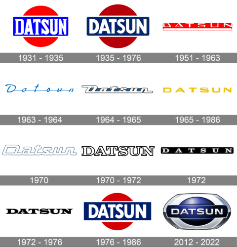
The very first Datsun logo featured a very elegant and powerful composition of a solid red circle (The main symbol of Japan), and a bright blue horizontally stretched rectangle with white lettering, placed over the circle. The white “Datsun” wordmark was set in the uppercase of a bold serif typeface, which was balanced by a thin white framing of the blue rectangle.
1935 -1976
This logo features a bold red circle intersected by a blue rectangle, which contains “DATSUN” in prominent white lettering. The use of a circular red element and deep blue rectangular background embodies a dynamic and easily recognizable design. The contrast between the blue and red creates a striking visual balance, underscoring the brand’s association with precision and reliability. This emblem symbolizes Datsun’s global presence during the mid-20th century as a leader in durable vehicles, particularly known for their fuel-efficient and accessible models.
1951 – 1963
The redesign of 1951 introduced a new concept for the Datsun visual identity. It was a Ted and white badge in a geometric shape — the horizontally stretched rectangle with rounded corners, was divided into two parts — the upper one in red, which was wider, and the bottom and thin one in white. The whole badge was outlined in thin red. The upper part of the emblem contained a bold stylized “Datsun” inscription in white. The custom sans-serif typeface looked sleek and progressive.
1963 – 1964

In 1963 the Datsun logo was changed again. This time it was a fine and elegant blue cursive inscription in the title case, with the letters placed far from each other and connected by a thin blue horizontal line coming from the middle point of one letter to the middle point of the other.
1964 – 1965
Exhibiting a sleek, stylized font, this logo spells “Datsun” in white letters on a narrow blue horizontal band, giving it a streamlined, modern appearance. The elegant curves and connected characters reflect the 1960s’ aesthetic trends and the brand’s forward-thinking, innovative nature. The logo emphasizes Datsun’s focus on stylish yet practical automobiles, embodying a sense of sophistication and momentum that resonated with the decade’s consumer base.
1965 – 1986
The logo, used by the Japanese brand in the 1960s featured a bold uppercase logotype in the gold-yellow shade. The typeface used for this version of the Datsun visual identity boasted sleek smooth medium-weight lines, softened corners, and wide full-shaped contours.
1970
The 1970 logo maintains a similar aesthetic, featuring the word “Datsun” in a more structured, angular style that emphasizes legibility. The white lettering is outlined in light blue, offering clarity while retaining the modern elegance of the previous logos. This design choice highlighted Datsun’s continual commitment to refinement and innovation, positioning itself as a progressive and stylish automotive brand amidst the rapidly changing automobile industry.
1970 – 1972
In 1970 the brand adopted a new color palette and a new style of the emblem. It was a light gradient gray horizontal over with red and black contours repeating the shape of the main badge in the middle part and a white ExtraBold wordmark set horizontally over the badge. The thick and massive serif letters of the inscription were outlined in light gray.
1972
With “DATSUN” written in bold silver lettering against a black rectangular background, this logo represents the brand’s emphasis on rugged durability and sophistication. The metallic letters convey a sense of strength and reliability, while the dark background evokes a classic, timeless appearance. This logo reflects Datsun’s strategic evolution, aligning itself with consumers seeking high-performance vehicles without compromising on reliability and quality.
1972 – 1976

The redesign of 1972 brought back the minimalist approach to the Datsun logo and introduced a new monochrome logotype in a fancy and progressive serif typeface. The solid black capitals of the inscription were executed in thick clean lines with the enlarged sharpened serifs in the ends. The logo looked stable, professional, and really strong.
1976 – 1986
 The iconic Datsun logo was composed of a red circle, symbolizing the sun, with a royal blue rectangular and a white bold wordmark on it. It was bright, stylish and meaningful. The all-caps of the wordmark was perfectly balanced in its simple sans-serif typeface.
2012 – 2022
The redesign of 2014 was meant to celebrate the brand’s revival and its come-back to the market. Datsun kept the original shape of the logo but enclosed it into a massive silver frame, which made it look less elegant but more masculine and brutal.
The red color left the Datsun emblem, being changed to gradient blue, which makes the emblem three-dimensional and dynamic.
The wordmark was also completely changed. Its typeface now features thinner lines and black shadow. The color palette was switched to gradient silver, balancing the framing.
The Datsun logo from 2014 looks like many other car logos, it lost its bright individuality but gained universality and confidence. It represents a strong and stable brand, which is focused on quality and aims to evoke a sense of trust and reliability.
Font and Color
The bold uppercase lettering from the Datsun official badge is set in a modern sans-serif typeface with full-shaped and slightly extended contours of the characters, clean lines, and straight cuts of the ends. The closest fonts to the one, used in the Datsun insignia, are, probably, Quantum Latin Bold, or Syncopate Pro Bold, but with some slight modifications.
As for the color palette of the Datsun visual identity, it is based on a combination of silver and blue, with deep and glossy gradients. The color scheme makes the badge bright and memorable, evoking a sense of security, excellence, and reliability. Blue is the color of trustworthiness and safety, while silver adds some chic and style to the emblem.


