Dark Horse Comics is a publishing company, specialized in comics and manga. The publisher was established in 1986 and today it is considered to be one of the most famous American comic book-oriented companies.
Meaning and history
The Dark Horse Comics logo was always based on the image of a black horse.
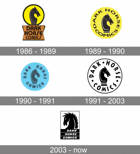
1986 – 1989
The original version of the Dark Horse Comics logo was designed in 1986 and de-picted an image of a black chess knight figure, facing right. The horse was enclosed in a circular frame and placed on a pedestal with the wordmark in a rounded sand-serif.
1989 – 1990
In 1989 the logo was changed. The knight figure was placed inside a yellow circle and the lettering was placed around the perimeter.
1990 – 1991
The redesign of 1990 switched the color palette to a light blue and refined the inscription.
1991 – 2003
In 1991 the logo became monochrome. This version stayed with the band until 2003.
2003 – Today
The Dark Horse Comics logo was always based on the image of a black horse. And all the early versions of the brand’s visual identity were more or less the same. However, the redesign of 2003 brought a fresh sharp approach to the brand’s logo, making it more modern and strong.
The major redesign of the Dark Horse Comics’ visual identity of 2003 brought a completely new image. The horse now faces left, and it doesn’t look like a chest figure anymore. Its sharp mane and accented nostrils show the fighting and strong spirit of the animal.
The lettering is now written on three thick lines which are placed horizontally under the horse’s head. The white inscription in all capitals is executed in a bold italicized sans-serif typeface with elongated and sharpened horizontal top bars of the letters.
Everything in the Dark Horse Comics visual identity shows strength and confidence. It is a powerful and modern logo, with a special character.


