Daraz was established in Pakistan in 2012. Today, it’s the country’s leading online marketplace and logistics company, which works in several markets of South Asia and Southeast Asia. Founded by Rocket Internet, Daraz was purchased by the Chinese giant Alibaba Group in 2018.
Meaning and history
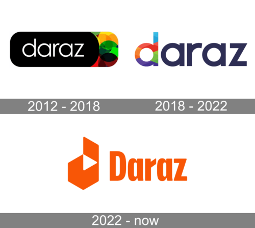
While the Daraz logo doesn’t explicitly state in which industry the company works, it does give a sort of hint on such themes as “diversity,” “brightness,” and “extravagance.” This refers both to the original version and to the one introduced in 2018.
What is Daraz
Daraz is an e-commerce portal, where you can purchase anything from clothing to electronic devices, to home appliances and beauty care products. Based in Pakistan, it also serves Bangladesh, Myanmar, Nepal, and Sri Lanka.
2012 – 2018
What made the earliest logo unusual was that it was dominated by black. The name of the brand was placed inside a pure black plate. The left part of the plate can be described as a rectangle with rounded corners, while the right part was more of an ellipsoid. The white wordmark was given in rather thin letters and due to this didn’t have much weight and let the black background rule the design.
However, there was also a bright spot on the right-hand side of the logo. It consisted of several overlapping circles in different colors, most notably green, yellow, and red.
We can assume that the black-and-white part of the logo is supposed to represent the classic elegance and chic of the clothes sold on the online marketplace. The wide splashes of color in the right-hand part, in their turn, are an ode to the funky items that risk-takers can also easily find on offer.
2018 – 2022
The update was introduced the same year Daraz was acquired by Alibaba Group.
Although the Daraz logo has gone through a complete overhaul, we can see that its authors made an attempt to preserve at least some of its heritage. And the attempt turns out to be quite successful.
The only element of the design is the wordmark in an austere sans. While the shape of the letters is pretty close to the previous one, they are a tad heavier, which is necessary to provide adequate legibility.
Unlike the original logo, the second one isn’t dominated by the dramatic black. Then again, its palette retains the essence of its predecessor using virtually the same visual language.
To begin with, black was replaced by navy blue. This time, the vivid colors are moved to the beginning of the word and are used to form the letter “d.” They have remained pretty bright, although the set of colors is slightly more diverse now, due to the addition of blue and purple. The bright part of the palette is also more straightforward as there are fewer nuances of the same colors than in the previous version.
2022 – Today
The redesign of 2022 has created a bright and stable Daraz badge, which is completely different from the two previous versions. The difference number one is the composition itself: now the logo is formed by two elements, a geometric emblem, and a title case lettering on its right. The emblem is a stylized solid hexagon with the upper right triangle being cut out and attached to the top border, making up a white triangle, which looks like a “Play” Button, in the negative space. The second thing is the color palette — the new version is set in an intense orange-and-white scheme, which evokes a sense of energy, motion, and power.
Colors and font
Color is key for the Daraz logo. This palette wasn’t used just for the sake of its looks, but it conveys a certain message referring to the brand’s promise.
The company has used the typeface as a pillar for its identity. Even when the logo went through a complete overhaul in 2018, it retained the same font only making it slightly heavier to enhance legibility. In this way, they made the transition from one logo to the other softer. When the changes are more dramatic, this may leave customers confused as it decreases recognizability.


