The Danville Dashers founded in 2011 belong to the Federal Hockey League. They took the name of their predecessors who played in 1981-1986, but not their logo.
Meaning and history
The Danville Dashers, a professional hockey team, were founded by Dick Berry in 1981. Originating in Danville, Illinois, the team was a part of the Continental Hockey League (CHL). The Dashers quickly made their mark in the hockey world, showcasing a blend of skill and determination that resonated with fans. One of their most notable achievements was during the 1982-1983 season, when they clinched the Continental Cup, the league’s championship trophy. This victory solidified their reputation as a formidable team in the minor league hockey scene.
Over the years, the Danville Dashers have undergone several transitions, including changes in league affiliations and ownership. Despite these changes, they have maintained a presence in the hockey world, participating in various leagues and continuing to develop talent. As of now, the Danville Dashers are a part of the Federal Prospects Hockey League (FPHL). They continue to compete with vigor and passion, representing the spirit of Danville in the hockey community. The current position of the company reflects a commitment to fostering local talent and remaining a competitive force in minor league hockey.
What is Danville Dashers?
The Danville Dashers are a professional minor league hockey team, known for their competitive spirit and rich history in the sport. They have been a part of various leagues and have a legacy highlighted by significant achievements, including a Continental Cup victory. Their current involvement in the Federal Prospects Hockey League demonstrates their ongoing commitment to excellence in hockey.
2011 — 2014
The Danville Dashers logo meets the requirements for the design of a sports team logo. It includes a stick saying that the team deals with hockey. At first sight the element at the bottom of the logo looks like a line underlining the word “Dashers”. In fact, it is a shaft of a stick.
The logo also depicts speed and energy that are essential in this kind of sports. It is the image of a reindeer. The team thought that this animal would convey their characteristics best and boost the morale. So the newly established team followed the tradition started by their predecessors ‒ to have a deer in the Danville Dashers logo.
2014 — Today
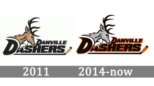
The franchise changed its logo in 2014. It was a slight modification of the color palette. Now it is black, orange, grey and white. The grey outline of the lettering and the eye of the deer turned orange.The head of the deer is on the left over the name of the team. The lettering “Danville Dashers” is in all caps and goes in two lines. The stylized “D” in both words and a tilted font imply speed.


