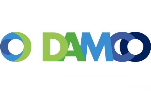
While the history of logistics brand Damco dates back to 1905, its logo looks young, fresh, and full of energy.
Meaning and history
The Damco logo includes the name of the brand and a circular emblem. The emblem represents a rather thick ring colored in green and two shades of blue. The pattern is pretty dynamic – it looks like an object sailing through the colored waters.
Each of the letters in the wordmark is colored in a different color. There are five shades altogether: in addition to the three ones featured in the ring, there is also a darker green and a darker blue. The palette and the shape of the “O,” which is the same as that of the ring symbol, helps to create a connection between the two parts of the logo.
What makes the design unique is the way the letters are positioned: each of them is partly hidden behind the previous one.
Font
The type showcased on the Damco logo is an austere, bold sans serif one. Due to the simplicity of the glyphs, they are legible even though they are positioned one in front of the other.
Company overview
The company was founded in 1905 by a Dutch entrepreneur CWH van Dam. Today, it is the brand of the Maersk Group’s logistics activities. It is the result of the merger of Maersk Logistics and Damco. In early 2019, it became a non-integrated brand of the A.P. Møller Mærsk Group specializing in air and ocean transportation.


