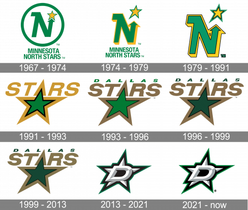
The ice hockey team the Dallas Stars has had only two logos since it acquired its current name in 1993. However, the history of the team actually dates back to the 1960s, and it has changed its name and location once, so it’s hardly a surprise that it had several other logotypes before 1993.
Meaning and history
The Dallas Stars were established in 1967 under the name of the Minnesota North Stars. At that time, they were playing as part of the National Hockey League‘s six-team expansion. In 1994, the franchise moved to Dallas and dropped the words “Minnesota” and “North” from its name.
1967 — 1974
The original Dallas Stars logo sported a large letter “N” stylized in the form of an arrow. The green arrow was pointing towards a yellow star with a green outline. The star represented Northern star, which created a visual link with the team’s original name. The design was placed in a bold green frame. Both the shades of green and yellow were bright and vivid.
1974 — 1979
The logo update left the visual core of the emblem untouched, but rather provided the finishing touch. The green circle disappeared, while the “N” acquired a yellow shadow.
1979 — 1991
Both the star and the “N” got a thin black outline making them look more refined.
1991 — 1993
The 1992/93 started a new era in the history of the franchise’s identity. Now, the star replaced the “N” as the visual core of the design. The colors of the star were inverted. In the previous version, the outline was green, while the filing was gold. The 1992 logo featured the gold outline and the green filling. The shades weren’t the same: they became darker, more saturated. The word “Stars” in large sans serif gold letters was placed on top of the star.
1993 — 1994
Following the team’s relocation to Dallas, the brand identity was slightly updated. The word “Dallas” appeared above the text “Stars,” while the colors grew somewhat darker.
The Dallas Stars logo was used in this form during one playing season only.
1994 — 1999
In 1995, the color scheme was tweaked once again. Both the shade of green and the shade of gold were darkened.
1999 — 2013

This version was exactly like the previous design, except with lighter, paler colors.
2013 — 2021
Not long before the beginning of the 2013/14 playing season, a new logotype was unveiled. Instead of the gold of the previous version, silver was introduced as the tertiary color, while green remained part of the palette, just a new shade was chosen.
At the center of the logo, the large italicized “D” can be seen. Behind it, there is a five-pointed star. Both the “D” and the star are given in white and silver on the black background, while the outline of the design is dark green.
2021 — Today

In 2021, they modified the green outline to look slightly brighter.
Font
While the only letter on the Dallas Stars logo is the “D,” the team has a full wordmark, too. It comprises the name of the franchise given in two lines. The word “Dallas” on the top is black, the word “Stars,” in larger letters, is green. The distinctive feature of the type (which is probably a custom or, at least, a customized one) is the sharp “claw” on some of the letters (“A,” “R,” “L,” and “D”).
Colors
The three colors comprising the team’s palette are Victory Green (PMS 3425), which is the primary color, Dallas Stars Silver (PMS 877), and black (PMS Process Black). While the official logo guidelines mention only these Dallas Stars team colors, in fact, the primary logo also includes white.
Green, in one shade or another, has been used on the team’s logo since 1968. While the players didn’t really have much input about the look of the 2013 logo, the franchise icon Mike Modano explained that he had one request: that green remains a part of the official palette. Among the reasons why he liked it, he mentioned that it wasn’t used on any other hockey logo within the NHL.
VICTORY GREEN
PANTONE: PMS 3425 C
HEX COLOR: #006847;
RGB: (0, 104, 71)
CMYK: (93, 13, 85, 44)
SILVER
PANTONE: PMS 429 C
HEX COLOR: #8F8F8C;
RGB: (143, 143, 140)
CMYK: (21, 11, 9, 23)
BLACK
PANTONE: PMS PROCESS BLACK C
HEX COLOR: #111111;
RGB: (17, 17, 17)
CMYK: (0, 0, 0, 100)


