There are few music groups in the world that pay so much attention to their image as Daft Punk. Hiding under the cosmic helmets was a well-thought-out aesthetics. The main robots of Daft Punk initially positioned themselves with rockers but ultimately the legendary duet was remembered by everyone as performers of electronic music. The group laid the foundation for French house music and proved that to be famous, a couple of helmets are suitable. Even though the team has already broken up, it will forever remain in the hearts of fans of electronics and synth-pop. Their influence extends beyond the music world, with their style and aesthetic inspiring countless artists, designers, and filmmakers.
Meaning and history
Daft Punk was formed by Thomas Bangalter and Gi-Manuel de Omem-Cristo. Friends, studying in the Lyceum Carno, decided to make a bustle when they were just 13 years old. The guys were inspired by the work of The Rolling Stones and The Beach Boys. Back in 1987, they created the Darlin group together with Loran Brankovitz. The trio did not last long, about six months. Musical critic Dave Jennings described the team as “daft punky trash”. In 1993, the trio turned into a Daft Punk duet. Since 2013, the duet no longer released albums but worked tightly with other performers. The clip, in which they announce the end of their activities after 28 years, is based on the 2006 film “Electroma”.
What is Daft Punk?
Daft Punk is a French musical electronic duet. The pair has been pushing the boundaries of electronic music, captivating audiences worldwide with their innovative productions, elaborate live performances, and futuristic aesthetic. One of the most striking aspects of Daft Punk’s career has been their commitment to maintaining an air of mystery and anonymity.
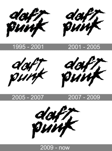
1995 – 2001
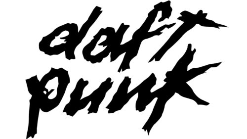
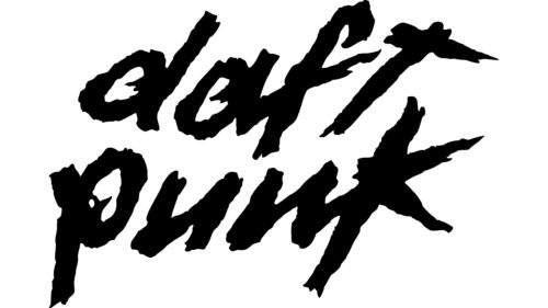
This logo was designed by Guy Manuel de Homem-Christo. The logo consists of the name printed in two lines. The funky brushstrokes reflect the duo’s innovative and futuristic approach to music. It looks bold and daring, showing that one should not be afraid to try something new.
2001 – 2005
The logo still features a stylized, futuristic font with the words “Daft Punk” written in bold, lowercase letters. For a change, the duo had swapped the colors. As a result, the inscription is done in white and the background is a contrasting black color. There are no more streaks and dots inside the letters themselves, so only the edges look uneven and funky. Such a small change allowed the logo to look lighter and the name to stand out even more.
2005 – 2007
The logo was polished, so it has smoother edges. At the same time, the designer did not overdo it, which allowed preserving the unique appearance. The designer also swapped the colors back, so the backdrop is no longer black. The logo’s simplicity and distinctive personality have made it instantly recognizable, allowing it to transcend the realm of electronic music and become a cultural icon. The redesign has also been carried out by Guy Manuel de Homem-Christo, who drew the original version.
2007 – 2009
The logo created in 2001 was brought back with a few modifications. The duo went for the rather rough font version, which is what it has been associated with for many years. It is interesting that the logo has barely changed since the duo first used it.
2009 – Today
The black-on-white logo was brought back in 2009. It perfectly complements their futuristic and electronic music aesthetic, so there was no need to come up with something new.
Font and Color
The logo features a custom sans-serif italicized font. It resembles quick brushstrokes and has streaks and tiny splashes that give it a unique and artistic appearance. The font has the same style as the Kotoba Dua Italic font. The fans also tried to replicate the custom font. One of the versions is the Dafter Harder Better Stronger font by Duncan Wick.
The logo features a black-and-white color palette. It is frequently displayed in white against a black background, creating a striking contrast. Such a color palette choice allows one to make a bold statement even without using any bright colors. It is a truly timeless choice that combines the meaning of black with white in a dramatic way.


