Sometimes even a single unusual detail is well enough to make a design unique and memorable. The logo of the Polish apparel brand Cropp is a good example.
Meaning and history
Cropp is a Polish fashion brand of contemporary streetwear offering women’s and men’s collections, complemented by a wide range of accessories and shoes.The brand was founded in 2004 when the first Cropp store was opened in Poland. In the following years, LPP launched this brand in the markets of Estonia, Slovakia, and Latvia in 2005 and also Lithuania, Russia, and the Czech Republic in 2006.
Cropp’s design office is located in Gdańsk, Poland. Production facilities are located in controlled factories in China.Cropp is part of the Polish company LPP, which was founded in the 1990s and now includes Reserved, Cropp, House, Mohito, and Sinsay.Today LPP stores are located in 20 countries in Europe, Asia, and Africa.
In particular, Cropp operates in Ukraine, Kazakhstan, Romania, Russia, Bulgaria, Serbia, Croatia, Slovenia, Bosnia and Herzegovina, Hungary, Slovakia, Czech Republic, Latvia, Lithuania, Estonia, Croatia, and Poland.
What is Cropp?
Cropp is a brand of casual and street style clothes and accessories for the whole family, which was established in Poland in 2004 as a part of a large company LLP. Today the brand operates in several European countries, as well as in Ukraine, Belarus, and Russia, and has more than 380 stores.
2004 – 2012
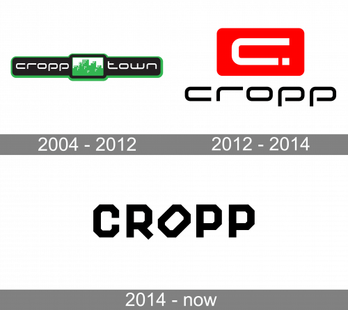
The first Cropp badge was designed in 2004 and stayed unchanged for eight years. It was a horizontally stretched rectangular banner with rounded corners and a softened square in the center. The banner featured a solid black background and had a medium-weight white lowercase inscription in a futuristic sans-serif typeface. As for the square, it was set in a green and white color palette, with the geometric city landscape set on a white background.
2012 – 2014
The redesign of 2012 has completely changed the style of the Cropp visual identity, executing the new badge in black, red, and white. The black lowercase logotype featured the same typeface as on the previous version and was now placed under a solid red rectangular emblem with an enlarged white letter “C” on it. The bottom end of the letter line was cut at the bottom, making up a white square dot.
2014 – Today
The Cropp visual identity is based on the octagon shape. Its logo is sharp, young and saucy, looking modern and strong in its simplicity.
The Cropp wordmark in all the capital letters is executed in a geometric sans-serif typeface, where each letter has eight angles.
One more unique detail of the Cropp inscription is the diagonal placement of the letter “O”, which looks like it is falling out of the signboard. It is a perfect reflection of a hound rebellious spirit of the brand and the audience it is focused on.
Executed in a monochrome color palette, the Cropp logo looks even more confident and strong, and when placed on a signboard, the letters have neon lighting inside, which adds a feeling of a night-club and eternal dance.
The Cropp logo is stylish and full of energy and progressive vibes, it shows the per-fect example of how the modern brand for young people should look like — simple yet brave and bold.
Emblem
The Cropp logo is just the name of the brand. The design forces behind the wordmark opted for a pretty bold type with a heavy angular shape. The rounded elements on the “C,” “R,” “O,” and double “P” have been replaced by cut angles. This is why the wordmark does not have prettiness or elegance of any kind – instead, it offers a fresh and independent vibe.
The “O” standing on one of its cut angles is the detail that gives a distinctive touch. The glyph seems to protest against the rules. This goes perfectly well with the brand’s core promise. Just compare the Cropp logo with the description of the brand on the website of its parent company: “aimed at young rebels… who live their own way, and the clothes serve to emphasize their individual style.”
Font and Color
The bold geometric logotype from the primary version of the Cropp visual identity is set in the uppercase of a modern sans-serif typeface with massive angular letters. The closest font to the one, used for the Cropp visual identity, is probably, Roadhouse Medium No 2.
As for the color palette of the Cropp visual identity, it is set in solid black with a white background, creating a strong professional image, which evokes a sense of progress and movement along with confidence and creativity.


