Crest is an American toothpaste brand, which was established in 1955. The company also offers a range of oral-hygiene goods, that are sold across the world under the brand’s name and the Blend-a-Med label.
Meaning and history
American company Procter & Gamble has been producing oral care products under the Crest brand since the middle of the 1950s.
Once fluoride was scientifically proven in the middle of the last century to have a positive effect on tooth enamel and fight tooth decay, fluoride compounds began to be used in the production of oral care products. In 1955, Crest toothpaste containing a compound of fluorine and divalent tin was introduced in the United States.
In 1981 a new active ingredient appeared in toothpaste – sodium monofluorophosphate, which was named “Fluoristat”. It was later replaced by sodium fluoride, but this did not mean the abandonment of the old, time-tested active ingredients. They are still used in different types of toothpaste, depending on their intended use and the type of dental problems they address.
Blend-a-Med is the localized name under which Crest toothpaste has been produced in Europe since 1987. Before that, it was the name of the toothpaste produced by the German company Blendax GmbH, located in Mainz. After the company was acquired by Procter&Gamble as part of its efforts to enter the European market, Blend-A-Medretained its name but changed its composition to that of the famous Crest toothpaste.
What is Crest?
Crest is an international brand owned by Procter&Gamble. The brand offers a wide range of dental and oral care products: toothpastes for different purposes, toothbrushes, dental floss, etc. Crest products are popular in many countries and are repeatedly approved by dentists.
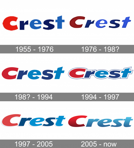
1955 – 1976
The very first Crest logo was created in 1955 by Donald Deskey, who is known for designing several visual identity concepts for Procter & Gamble products.
The wordmark-based logo was drawn in an extra-bold sans-serif typeface with the first “C” in red and other letters in two different shades of blue.
Blue color reflects freshness and safety, while the first “C” was made red in order to make the logo recognizable and it worked. During the whole brand’s history, the Crest wordmark was only modernized, never redesigned completely.
Almost all the versions of the Crest logo featured the original color palette, but the typeface was refined throughout the years.
1976 – 198?

In 1976, the logo was redesigned, although the style of the letters remained largely unchanged. They did make them darker and tilted them to the right, but that’s about it.
198? – 1994
In this design, the resolution of the previous lettering was improved, they streamlined the letters and made them smoother. The coloring also turned back to the former bright palette, while the font itself changed little.
1994 – 1997
In the 1994 update, the letters were squeezed and made shorter. Moreover, each was outlined with thick, white framing and then a much thinner blue line on the outside.
1997 – 2005
A few years later, they got rid of both layers of framing and remodeled the letters. Primarily, the style was reimagined into a more fluid, less strict approach. The colors also became paler compared to the previous design attempts.
2005 – Today
The last redesign of the Crest visual identity was held in 2005 and it was the first big change for the brand — now the lettering is composed of only two colors and the typeface boasts cleaner and more elegant lines.
Executed in a bold italicized sans-serif font, which is similar to Arias Black, the Crest nameplate has its first “C” in red and another lettering in light blue. There is also a white outline of the inscription now, which gains a shining star effect around the letter “C”.
The Crest logo is minimalist year bright and instantly recognizable. The last brand’s redesign made it look more modern and strong, but keep its individuality and uniqueness.
Font and Color
The bold and sleek title case logotype from the primary badge of Crest is set in a custom sans-serif typeface, which is pretty close to such fonts as Indecise Expanded Semi Bold Italic and Savant Italic, but with some contours modified.
As for the color palette of the Crest visual identity, it is composed of red and blue gradients, which make up a bright and elegant combination, standing for protection and reliability, with the red “C” pointing at the professionalism and expertise of the company.


