Crackle is an American brand of a video streaming service provider, created by Sony in 2007. The platform operates in over 20 countries across the globe and is also available on the flight of several airlines and in a few hotels worldwide.
Meaning and history
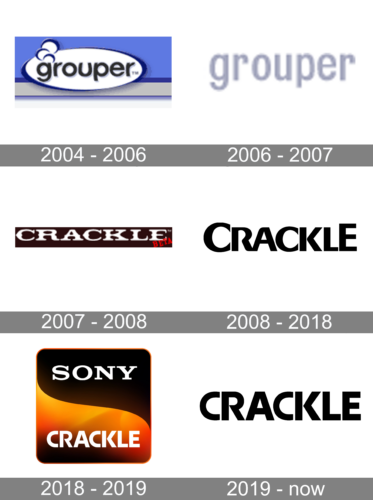
Sony acquired Crackle four years after the service was launched. The international giant has announced signing a contract with Crackle, which provided its video movie streaming service for PlayStation Home users, in 2011.
During the first months, the Crackle streaming service was only available in North America, and PS Home users were able to watch a variety of movies, including Step Brothers, Cruel Intentions, Snatch, Resident Evil, A Few Good Men, and Final Fantasy: Advent Children, for free.
By today Crackle had become a global service, with its presence in more than 20 countries worldwide.
What is Crackle?
Crackle is the name of an online streaming service, created by Sony in 2007. Today it is an international online platform, which operates in more than 20 countries across the globe, offering its users a full range of videos, available to watch online in different languages.
2004 – 2006
The company’s roots can be traced back to the Grouper brand. It used a black wordmark in a rounded sans serif type placed inside a white ellipse.
2006 – 2007
Only the name of the brand stayed, due to which the logo adopted a minimalist style.
2007 – 2008
The “beta” logo showcased the word “Crackle” in white inside a black rectangle. The letters were wide and short, with characteristic small details breaking the glyphs into two parts.
2008 – 2019
The first “official” Crackle logo was introduced in 2008 and stayed with the brand until 2018. It was a traditional logo for the industry and the sharp sans-serif typeface of the wordmark made it stand out on the list of competitors. The white and orange color palette looked fresh and crispy, evoking a friendly and kind feeling.
2018 – 2019
The redesign of 2018 made the Crackle logo more corporate and strict. The current emblem consists of a square with rounded angles. It is divided into two equal parts by a curved line. The upper part in black comprises a “Sony” lettering in its signature typeface, while the bottom part is colored orange and has a white “Crackle” inscription on it.
The “Crackle” nameplate is executed in the same font, used in the previous platform’s visual identity. Its sharp angles and straight lines make it look modern and energetic.
2019 – Today
The new logo looks like a balanced mobile app icon of a strong and professional product. It is bright yet strictly elegant and shows the brand’s roots.
Font
The brand’s font obviously changed throughout the existence of their logos, but since 2008 they favor generally similar styles. The 2019 font in particular uses all capitalized letters. In appearance, they were bold, tall and very close to one another. The typeface was a sans-serif with straight lines, abrupt turns and right angles. There was one peculiar trait: the side bars in the ‘R’ and ‘K’ barely touched the middle point of the main stems, creating very sharp turns.
Color
The coloring was predominantly black since 2008. The letters could use other colors if they needed to stand out against the background. However, it was black 95% of the time. The only big exception was for the 2018 logo, which used white letters, placed onto a square figure, whose coloring used a mix of brown, orange and black.


