

![]() Cracker Jack Logo PNG
Cracker Jack Logo PNG
Cracker Jack is a brand with a long history. The caramel-coated snack was created by Frederick William Rückheim in 1896, and acquired by the global leader PepsiCo a century later, in 1997, through its subsidiary, the Frito-Lay. Interestingly, Cracker Jack is considered to be the world’s first Junk Food.
Meaning and history
![]()
Caramel popcorn dates back to 1893. It was then that the first version of this sweet snack was presented to the public at the World’s Fair in Chicago. And today, there is even a Caramel Popcorn Day, which falls on April 6.
In general, popcorn is the most famous snack in the world. But the leader among lovers of caramel popcorn is the United States. Nowhere is it eaten more than in this country. And it was here that the first commercial brand of sweet popcorn was founded, the Cracker Jack.
Cracker Jack is a snack brand of caramel-coated popcorn and peanuts. It was created by German immigrant Frederick William Rückheim in 1896. The snack became popular during World Wars I and II. In 1964, Borden, Inc. acquired Cracker Jack from Rueckheim Bros. & Eckstein Inc. And in 1997, Frito-Lay (PepsiCo) acquired the rights to Cracker Jack from Borden.
Today the product is available in three types: the Cracker Jack Original, The Cracker Jack’D, which is a line of snack mix products that includes a variety of ingredients such as pretzels and almonds, and the Butter Popcorn.
What is Cracker Jack?
Cracker Jack is the name of a brand of sweet snacks based on popcorn and peanuts from PepsiCo. The product was first introduced in the late 19th century in the United States, and it can still be found on store shelves across the country.
The iconic symbol of the brand, Sailor Jack and his dog Bingo, was first introduced in 1912 and has undergone several significant modifications throughout the years, however, all the Cracker Jack logos contain their image.
1896 – 1937
![]()
The original Cracker Jack logo was composed of a blue image of a boy wearing a sailor suit and a small dog sitting near his leg, and a diagonal banner with a thick red framing and a bold red wordmark in a fantasy serif font with curls on all the three “C”s.
1937 – 1987
![]()
The redesign of 1937 has refined the drawing of Sailor Jack and Bingo, redrawing the boy’s hat in white, and slightly changing the position of the dog. The banner with the lettering was also changed: the name of the brand was now set in two levels, with the typeface becoming more traditional.
1987 – 2013
![]()
A new version of the Cracker Jack visual identity was introduced in 1987. The bold red lettering gained a blue shadow, and the sailor suit of Jack was redrawn in different shades of blue, making the image more realistic. The boy was now holding an enlarged package of caramel popcorn, with a striped red and white pattern.
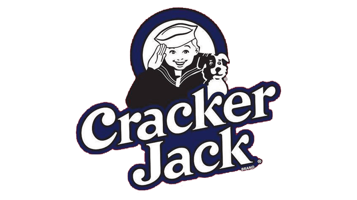
2013 – Today
![]()
In 2013 the Cracker Jack logo was significantly redesigned. The image of Sailor Jack and Bingo moved into a circular medallion in the top part of the composition, and now it is just the upper part of the boy’s body. Also, the emblem was redrawn in black and white. As for the lettering, it is placed under the emblem, in bright red with a delicate blue shadowing.
Font and color
The fancy title case lettering from the primary logo of the Cracker Jack brand is set in a custom serif typeface, which has somewhat in common with such commercial fonts as VVDS Rashfield, TS Veracruztrade, and Creamtrade, but with significant modifications of the characters’ contours.
As for the color palette of the Cracker Jack visual identity, it has always been based on the blue, red, and white tricolor, but with the latest redesign, the scheme was expanded, including also black. These colors make up a timeless and elegant combination, that will always stay actual.


