 Courage The Cowardly Dog Logo PNG
Courage The Cowardly Dog is the name of an animated tv-series, which was launched in 1996. Being a horror-comedy, this funny show has released over 50 episodes (4 seasons) and became very loved all over the globe.
Meaning and history
Courage the Cowardly Dog is anAmerican animated series created by John Dilworth in 1999. The tv-series was really popular at the beginning of the 2000th, and even got nominated for an Academy Award.
The tv-series tells us a story about Courage, an abandoned dog, found by his new owner, Muriel, who lives in the town of Nowhere, Kansas with her husband Eustace Bagg. Courage is a dog who is afraid of almost everything around him and uses his computer to fight enemies and save himself and his owners.
Courage loves his owners very much and is ready to do anything for them. Always rescuing his masters from monsters. Muriel is also the epitome of kindness and love, but her husband Eustace is the complete opposite. Another main antagonist in this animated series is Catz, a red cat with sadistic tendencies who speaks with a Spanish accent.
What is Courage the Cowardly Dog?
Courage the Cowardly Dog is the name of an animated tv-series, created in the United States in 1999 in the horror-comedy genre. By today there have been 4 seasons with over 100 episodes of the tv-show released. Courage the Cowardly Dog can be seen in various countries across the globe, in English.
1994
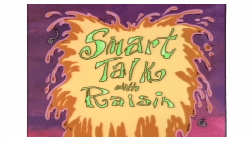
The history of Courage the Cowardly Dog started five years before the first release of the tv-seres. It was in 1994 when The Chicken from Outer Space cartoon saw the light. The logo for the cartoon featured a super bright yellow, line-green, orange, and purple color palette; with the name of the animation written in a custom font in three lines over a light-yellow banner, decorated by stylized splashes in various shades of orange, and set against a gradient purple background.
1996
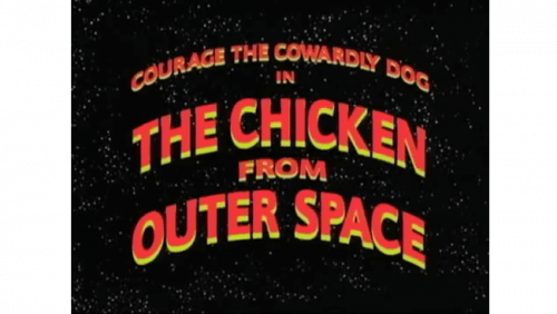
In 1996 another The Chicken From Outer Space cartoon was released, and a new logo was designed for it respectively. The new badge was executed in a more modest and graphical style, with the red and yellow lettering arched in five levels and placed against a background in black and yellow, making up a super night sky with millions of tiny yellow stars.
1999 – 2002
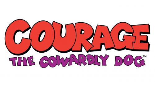
The first episode of Courage The Cowardly Dog saw the light in 1999, and the logo for the tv-series was designed in the same year. The concept was built around an enlarged red “Courage” lettering in a graffiti-like sans-serif typeface, with the characters outlined in black, and featuring a thin solid black shadow. The main line was accompanied by purple “The Cowardly Dog” lettering in the same font, but with the smaller characters placed at a slight distance between each other. All of the elements were set against a plain white background.
2014
The logo, released in 2014, was created for the special edition of the franchise, The Fog of Courage, and was fully based on the previous badge, but with the color palette alternated, and the lettering accompanied by a graphical element. The purple tagline was redrawn in light blue, and now both wordmarks were set on a solid blue background, with the circular light blue medallion, where the pink portrait of Courage was depicted, placed on the right side of the logo.
The visual identity of the animated horror series has always been changed from episode to episode and complemented by different fonts and colors of the episodes’ names. But there is one logotype, that has been constantly in use by the show since 1999.
The logo, designed for Courage The Cowardly Dog at the end of the 1990s, is composed of two text-based parts — the massive “Courage” in red, placed diagonally, and the jumpy “The Cowardly Dog” in purple, set in three levels, under the main wordmark, in its right side.
Both parts are executed in a custom hand-drawn sans-serif typeface with extra thick lines and straight cuts and edges. Each letter on the logo is outlined in black, and the “Courage” part has a black shadow.
This graffiti-style logo is bright yet not too much, it’s massive, yet not overloading. Despite its simplicity and visible amateurish execution, it looks cool and memorable, making the show stand out in the list of the competitors and adding a special mood to it.
Purple is the symbol of mystery and imagination, while red adds a sense of power and passion. Though considering it is a horror-comedy, red can also stand for blood, while purple and black add a feeling of danger.
Font and Color
The bold custom lettering from the Courage the Cowardly Dog badge is set in an extra heavy handwritten graffiti-style font, which looks very friendly and cool. The closest fonts to the one, used in this insignia, are, probably, Zubilo Shadow, or Killjoy Outline Regular; but with some significant modifications of the contours, and a few extended shapes of the characters.
As for the color palette of the Courage the Cowardly Dog visual identity, it is based on deep and dark shades of red and purple, which stand for passion, creativity, and imagination, and make up an adventurous and playful image, which perfectly suits the essence of the franchise.


