Cornetto is a renowned brand specializing in cone-shaped ice cream treats. As a member of the Unilever family, it’s widely recognized globally. Its product range encapsulates creamy ice creams adorned with a crisp wafer cone, often ending in a solid chocolate tip. Contemporary innovations have expanded their flavors, catering to diverse palates. Predominantly popular in Europe and Asia, Cornetto has made significant inroads in many international markets. With a blend of classic and novel flavors, they consistently appeal to both traditionalists and the adventurous. Unilever’s vast distribution network ensures Cornetto’s presence in multiple regions.
Meaning and history
Cornetto’s journey began in Italy in the 1960s, birthed from the idea of merging creamy ice cream with a crisp cone. The name, derived from “little horn” in Italian, mirrors the treat’s distinctive shape. The initial challenge was maintaining the cone’s crispness with the ice cream. Overcoming this, a thin layer of chocolate was added inside the cone, not only enhancing taste but ensuring crunchiness.
SpA Dolceria Motta, an Italian company, first introduced Cornetto to the local market. Witnessing its success, other European countries started importing it. By the 1970s, its footprint extended to various parts of Europe. The pivotal moment came when Unilever, the global FMCG giant, recognized its potential. Acquiring the brand, Unilever amplified Cornetto’s reach through its expansive distribution channels.
Under Unilever’s umbrella, Cornetto underwent brand evolution, encompassing diverse flavors, campaigns, and collaborations. This rebranding aided Cornetto in positioning itself not just as an ice cream, but a holistic experience. One of its memorable campaigns, “Cornetto Trilogy”, involved collaborations with film industries, emphasizing the brand’s pop-culture relevance.
Manufacturing enhancements allowed for a wider range of flavors and textures, such as the double-chocolate tip and varied toppings. Limited edition flavors, often tied to local tastes or global trends, became frequent, ensuring the brand stayed contemporary.
Today, with its roots firmly Italian but with global recognition, Cornetto represents a blend of tradition and innovation. From a simple Italian treat, it has transformed into a universal sensation, adored by millions, yet remaining true to its core – a creamy delight within a crunchy cone.
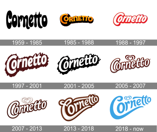
1959 – 1985
The image showcases a distinctive and playful logo that reads “Cornetto.” The typography is characterized by its bold, curvaceous black letters. The fluidity of each letter seems reminiscent of something soft and creamy, possibly hinting at the nature of the product. The overall design is minimalist, using just black and white, emphasizing the logo’s boldness and the brand’s confidence.
1985 – 1988
This image portrays a vibrant logo spelling “Cornetto.” The characters are in bold, with a gradient of golden-yellow hues, which transition to a darker shade, possibly hinting at a sunlit ambience. Each letter is outlined with a subtle dark contour, which gives depth and dimension to the text. The typeface appears buoyant, with the ‘C’ and ‘O’ especially pronounced, lending a whimsical touch to the design. The backdrop is plain white, making the colorful logo stand out prominently. The entire presentation exudes a sunny, cheerful vibe, synonymous with delightful experiences.
1988 – 1997
Displayed is a crisp logo that reads “Cornetto.” The typography is rendered in a vibrant shade of red, with each letter encased in a white outline, offering a visual pop. This combination lends the design a retro flair, reminiscent of neon signage. The characters flow smoothly with a certain buoyancy, particularly emphasized in the ‘C’ and ‘O’. Set against a clear, unembellished backdrop, the logo grabs immediate attention. The overall aesthetic exudes a playful and inviting atmosphere, enticing viewers to engage with the brand.
1997 – 2001
The presented logo showcases the word “Cornetto” in a bold, luscious burgundy hue. The typeface exhibits a dynamic contrast, with its sweeping, curling lines and whimsical flair reminiscent of dripping chocolate. The outer contours of the letters possess a wavy, almost melting quality, giving the design a sense of movement. The letters seamlessly flow into one another, creating a harmonious and unified appearance. The depth and richness of the color, combined with the playful contours, evoke a sense of indulgence and luxury, beckoning one to partake in the delights the brand may offer.
2001 – 2005
The logo portrays the word “Cornetto” in a striking black tone, rendered in a fluid and dynamic typeface. The letters display pronounced, flowing curves, reminiscent of silky ribbons or perhaps the contours of creamy desserts. Intermittently, the outline of the letters demonstrates a splash or drip effect, suggesting a sense of motion or perhaps the melt of a frozen treat. The contrast of the bold black against the stark white background emphasizes the playful and undulating nature of the design, echoing themes of indulgence and temptation. The overall impression is one of elegance intertwined with a dash of playful mischief.
2005 – 2007
The logo prominently displays the word “Cornetto” in a rich, chocolate-brown hue. The typography is characterized by a glossy, 3D effect that makes each letter resemble luscious, molten chocolate or perhaps caramel. The contours of the letters are rounded and smooth, lending a sense of fluidity and decadence. Above the “C” in “Cornetto”, there’s an abstract heart swirl, which adds a touch of love or passion to the design. Adjacent to the end of the word, there’s a circled “R” symbol, indicating a registered trademark. The creamy white backdrop contrasts the dark text, further accentuating its delectable appearance. The overall vibe of the logo is indulgent, evoking sensations of a luxurious dessert experience.
2007 – 2013
The emblem features the brand name “Cornetto” in an alluring, cocoa-tinted hue. The characters possess a liquefied chocolate allure, resembling ribbons of rich, dripping syrup. The glossy, three-dimensional rendering of the lettering instills a sense of depth, suggesting a tactile, velvety texture. Hovering gracefully above the initial “C”, a stylized heart crafted from two swirling strokes evokes sentiments of romance and treat-filled delight.
2013 – 2018
The emblem presents the word “Cornetto” in an exquisite, molten chocolate shade. The script flows as though it were drawn with a velvety, creamy flourish, conjuring images of luscious dessert drizzles. The lettering is gracefully elongated, curling playfully at the tips, with the most notable curl accentuating the initial “C”, evoking the charm of vintage calligraphy. This elegant textual design is encapsulated within an abstract, elongated form that hints at the silhouette of an ice cream cone. The gleaming, three-dimensional effect on the letters imparts a tangible, edible sensation.
2018 – Today
The logo displays the word “Cornetto” in a refreshing ice blue tone, evoking the sensation of a cold, delightful ice cream on a summer day. The font is fluid, with curves resembling the creamy swirls of soft-serve ice cream. Above the middle portion of the name, there’s a stylized heart emblem, also in varying shades of ice blue, which could symbolize the love many have for this frozen treat. The expansive “C” at the beginning and the elongated tail of the last “o” give the impression of an ice cream cone’s twirl. Overall, the design and color palette strongly evoke the chill and pleasure associated with enjoying a Cornetto ice cream cone.


