Commerzbank is the name of one of the largest and most reputable financial institutions in Europe, which was established in Hamburg, Germany, in 1870. Today the bank successfully operates not only in European countries but has its subsidiaries on different continents. The yearly revenue of Commerzbank is about 8,5 billion Euro.
Meaning and history

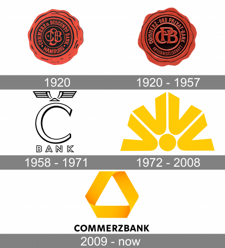
Since the bank boasts a very long history, its visual identity has undergone several redesigns throughout the years. There were different styles and color palettes adopted for the Commerzbank logo, from classic seals to modern abstract symbols. Let’s check the development of the German bank’s visual identity below.
1920

The logo, created for Commerzbank in 1920 has only stayed with the company for several months, as was designed when the bank’s name was “Commerz Disconto Bank Hamburg” and a few months later it was renamed into “Commerz und Privat Bank”. So the first logo boasted a red and the Black Sea with the wordmark written around the circular perimeter, from the inner part. In the very center, there was an elegant “CDB” monogram.
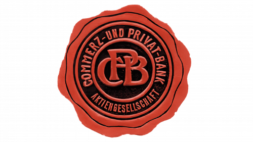
1920 – 1957

The new logo appeared right after the name change of the bank, at the end of 1920. The monogram was changed to “CPB”, and the typeface used for it got bolder and stricter, with all the cursive style gone. As for the main wordmark, it was also rewritten in a cleaner and stronger sans-serif typeface with neat and slightly narrowed contours of the capital letters.
1958 – 1971
Another old version of the logo featured a large “C” topped with a pair of wings. Below, the lettering “Bank” could be seen.
The wing design was inspired by the Ancient Roman myths about Mercury, the messenger of the gods. His prototype in Greek mythology was Hermes, the god of travelers and merchants. The introduction of the wings logo took place the same year when the bank changed its name to Commerzbank Aktiengesellschaft.
The need for a distinct logo emerged as a response to the new era when marketing started to play an increasingly important role in banking. The choice of the wings and Mercury theme could be explained by the fact that Commerzbank was founded primarily by Hamburg merchants and private bankers. Also, its main purpose originally was financing trade, which is another reason for opting for Mercury’s wings.
1972 – 2008
The design was inspired by the wind rose. It looked like four letters “V” sharing the same circular center. The “V’s” formed a semi-circle. The glyphs symbolized the four winds.
The logo was designed by a French agency. In the years leading to the introduction of the new logo, Commerzbank signed a cooperation agreement with several European banks, and the four winds were supposed to demonstrate that Commerzbank and its partners are open to the world. Also, it represented a diverse range of customer services.
There were at least three versions of this design. One of them featured the emblem in dark blue on the yellow surface. In another logo, the winds were yellow on the white surface. There was also a version where the winds were yellow with blue trim.
2009 – Present
When Commerzbank acquired Dresdner Bank in 2008, it adopted a new brand identity, which also reflected this acquisition.
The ribbon design seen on the current Commerzbank logo was borrowed from the logo of Dresdner Bank. According to the company, each of the three segments of the ribbon has a meaning: they represent employees, customers, and business partners. The three dimensions symbolize dynamism, continuity, and stability. The bank used to have a flat logo earlier, though.
Color
While you can come across older versions of the Commerzbank logo in green, the current ribbon is yellow. This color is part of the company’s heritage. For instance, in 1984, an advertising campaign featured the sun. The yellow looks vibrant and full of energy representing self-assurance and performance.
Font
Next to the ribbon, the name of the bank can be seen in a bold sans looking perfectly clean and legible. The type is supposed to convey stability and quality, according to the bank’s website.
Company overview
While Commerzbank AG was founded in 1870 in Hamburg, Germany, today its headquarters are located in Frankfurt am Main.
It is known as one of the country’s major banks (second-largest by the total value of its balance sheet in 2019). Back in 2018, the number of employees almost reached 50,000.


