

![]() Fifth Third Logo PNG
Fifth Third Logo PNG
Fifth Third is a bank that has greatly expanded throughout its history. It was done mainly with the acquisition of other banks. There were over 400 such mergers, which included a purchase of Citizens Heritage, Cumberland Federal, State Savings Company, CitFed Bankcorp, CNB Bancshares, Old Kent Financial, First Charter, and MB Financial. Such a strategy allowed the corporation to become one of the twenty largest banks in the United States.
Meaning and History
![]()
The name of the bank originated when the Fifth National Bank and Third National Bank joined forces in 1908. This led to the appearance of The Fifth Third National Bank of Cincinnati. The roots, though, go back to 1858 when the Bank of the Ohio Valley was created. It was later acquired by the Third National (est. 1863). Due to another merger, it was called The Fifth Third Union Trust Company for some time and only in 1969 it got the current name Fifth Third Bank.
What is Fifth Third?
Fifth Third is a well-established bank with a very long history. As it might be assumed, the bank provides financial services, but one might also receive brokerage services along with equipment leasing financing through its subsidiaries.
1986 – 2014
![]()
Although the designers of this logo did not create anything extraordinary, it stayed with the company for almost thirty years. Even afterward, it underwent only minimal modifications. They presented the name of the bank printed using a sans-serif, bold font with the first letters being capitalized. The inscription was accompanied by a square parallelogram of a blue color, which was also used for the name. It had numbers five and three printed in white and aligned closer to opposite corners as well as being separated by a slash line. This added interest and dynamics to the emblem.
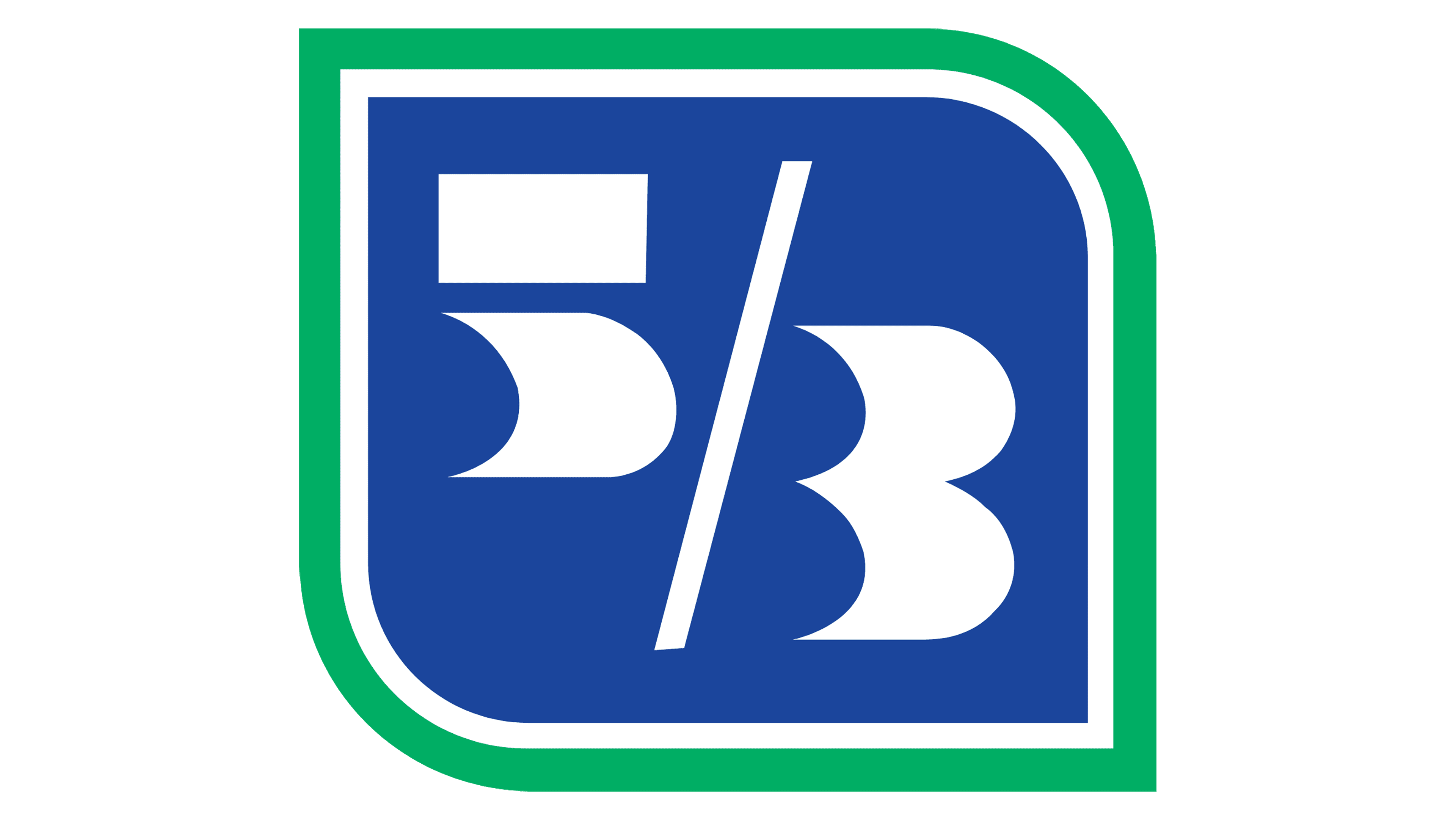
2014 – Today
![]()
An updated logo was presented in 2014. All the basic elements stayed there. The square was no longer tilted and now had a thin white which was followed by a green outline. There was also a variation that featured a green curved line going behind the square and extending slightly further than the name under the emblem. The designers used a different font this time. It had flare serifs and all uppercase letters, although the first letters were still made a bit higher than the rest. The organization also used a variation where the name was printed to the right of the emblem.
Font and Color
The original color palette had blue and white. While white is a good neutral color that is also associated with perfection, blue is typically used to represent the trustworthiness and reliability of an organization. The green color, which was added in 2014, symbolizes growth, stability, safety, and reliability. Initially, the designers used a sans-serif font that had very unique cuts. In some places, they were diagonal, while in others they were curved inside. Then, it was replaced by a Copperplate-esque font.


