Commonwealth Bank is an Australian financial organization, which was established in 1911 by the government, and became a public company in 1991. Today the bank operates not only across Australia but also in the USA, UK, and New Zealand through more than one thousand operating offices and almost 5 thousand ATMs.
Meaning and history
The visual identity of the large Australian bank has had two major redesigns, which featured completely different concepts and execution. The history of the Commonwealth Bank logo is short, yet very interesting due to the variety of color palettes, compositions, and styles.
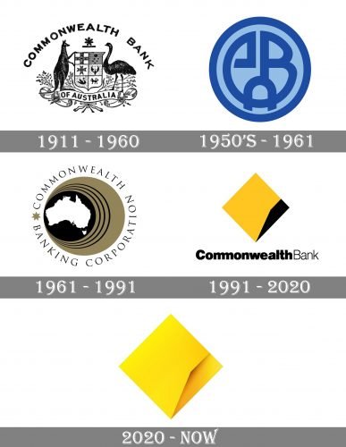
1911 – 1960

The first logo depicted the bank’s name, as well as a bit modified Australian coat of arms. On it, there was a shield, with a kangaroo and an emu bird standing on its either side. In the background we can see many sticks and leaves. The shield was slightly elongated, and the pictures in it were rearranged slightly.
1950s — 1961
The logo of the bank from the 1959s was composed of a bright rounded badge, executed in two shades of blue — a lighter one for the background, and a darker for a stylized monogram, consisting of “CBA” letters, which stood for “Commonwealth Bank Australia”. The badge was outlined in the thick frame in the same shade of blue, which was used for the monogram.
1961 — 1991
The new elegant logo was created for the bank in 1961. It was a stylish yet delicate circular image with a thin black wordmark around it. The emblem featured a beige background with a bold black circle on the left side. The circle was outlined in three thin black circular frames and had a white contour of the Australia continent placed in the middle.
The lettering was executed in a sophisticated serif typeface, and all capital letters of the inscription have a lot of space between each other, which added lightness and style. A beige seven-pointed Star was placed on the left from the emblem, pointing at the beginning and the end of the wordmark.
1991 — 2020
The redesign of 1991 brought a new concept and color palette to the Commonwealth Bank’s visual identity. The new emblem features a yellow and black palette and comprises a solid rhombus, which is all yellow, with a delicate geometric fragment in black along its right side.
The wordmark in black is placed under the emblem and executed in two wrights of one sans-serif typeface.
2020 – Today

The 2020 logo has the same rhombus, but the black section turned a shadowed yellow instead. Also, the wordmark was removed.
Font and color
The Commonwealth bank inscription is written in a title case and boats a bold and modern sans-serif typeface, which is very similar to Breul Grotesk. There is one unique element in the wordmark — the double “M” features its letters sharing one of the vertical bars, creating a sense of unity and solidness.
The combination of yellow and black stands for energy and power, being the eye-catcher of the whole logo, it also represents happiness and growth.


