The Comfort brand is an umbrella brand for five subbrands, including Comfort Suites. It is the best-known brand in the portfolio of Choice Hotels International, Inc, a hospitality franchisor located in Rockville, Maryland, United States. It is a midscale brand almost everywhere it works, except in Norway, Sweden, and Lithuania, where it is an economy brand. The total number of properties exceeds 3,700.
Meaning and history
The history of the brand goes back to 1981. The earliest Comfort Suites logo was an almost exact copy of the logo of its sister brand Comfort Inn. We can see the same friendly type and the setting sun over the dramatic black background. The only difference was, of course, the second word in the name.
1982 – 2002

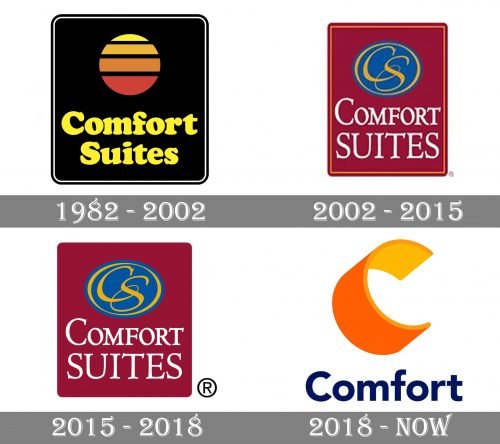
The very first logo for the Comfort Suites chain was designed in 1982 and stayed in use for almost twenty years. It was a dark yet friendly and memorable badge, composed of a plain black square with rounded corners, in a double thin black and white outline, the stylized sun in different shades of yellow and orange, with the horizontal black stripes over it, and an emboldened yellow wordmark, set in two lines under the sunset image, and executed in a sleek rounded serif typeface, written in a title case.
2002 – 2015
In the early 2000s, Choice Hotels modified the visual identities of its brands. Comfort Suites received an elegant emblem that featured the “CS” monogram. The interlacing letters had picturesque curls and curves and were placed inside a golden ellipse. The filling of the ellipse was blue.
Below, the name “Comfort Suites” could be seen. It showcased a serif type with unobtrusive decorative details. The wordmark and symbol were placed inside a dark red rectangle with rounded corners.
2015 – 2018
Choice Hotels slightly simplified the logos of its brands. In the case of Comfort Suites, it meant only that the gold border was removed.
2018 – Today
In 2012, Choice Hotels started transforming all the properties from the Comfort group. The transformation program finished in 2018 with the introduction of a new set of logos.
The visual brand identity went through a complete overhaul. While the new logo echoed the palette and shapes of the logos of other brands owned by Choice Hotels, you can hardly say the same about the Comfort Suits emblem.
Now, the design was dominated by the large “C” in orange and yellow. Bellow, the word “Comfort” could be seen. It was dark blue (almost black) and featured a clean, unpretentious sans serif font.
In addition to the logo of the umbrella brand, you can also come across a full Comfort Suites logo. Here, the word “Comfort” is white, and there is the writing “Suites” in orange below. The wordmark and emblem are housed inside a black rectangle.


