Vitória Sport Clube is the name of a Portuguese football club, which was established in 1922. The club, nicknamed “The Conquerors” (which is “Os Conquistadores” in Portuguese), is considered to be one of the strongest in the country and has Tiago Mendes as the manager.
Meaning and history

The club was founded in 1922 and plays its home games at Afonso Henriques Arena. Since 1941, the team has played in the top league of the Portuguese championship, having been relegated only once, in the 2005/06 season. The team often took part in the UEFA Cup. In Portugal, the club is usually referred to as “Vitoria Guimarães” to avoid confusion with the other “Vitoria” from Setúbal. It was likely named after Vitória de Setúbal, which at the time was the main contender for the Campeonato de Portugal.
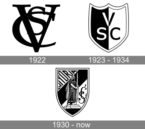
1922

The original logo of the club was just a monogram. It was no simple monogram, though, as the letters were drawn in such a way that the logo had a grand, strong, and at the same time sophisticated appearance. The clean, straight strokes had different thicknesses and the bracketed serifs added an elegant touch. Despite having a timeless look, the logo was used only for a short period. Maybe we will see this monogram in future logos.
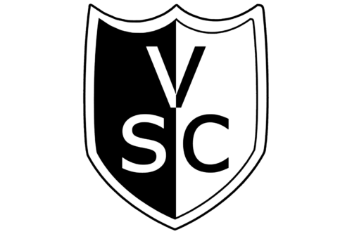
1923 – 1934

The new logo of the club had a shield shape, which is quite typical for sports clubs. It had a triple outline, with a thicker white line in the center and thin black lines on either side of it. The shield itself was split in half vertically by color. The left side was black with white lettering and the right was white with black lettering. The initials “VSC’ were done using a sans-serif font with sleek lines and straight cuts that resembled Greenwich Medium by Mint Type.
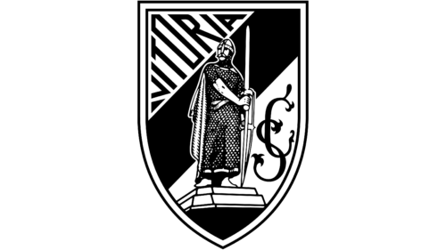
1930 – Today
The visual identity of the Portuguese football club has been very constant during its history. The traditional and very detailed badge hasn’t been redesigned for years, as it perfectly represents the spirit and character of the club.
The Vitoria Sport Clube logo is composed of a monochrome Sheila with classic contours and a double black and white outline. The body of the shield featured a diagonal striped pattern with two wide white stripes and the black one in the middle.
On the upper white corner of the crest, the “Vitoria” lettering in art-deco sans-serif is placed. The letters feature different heights, as the whole word repeats the triangular contours of the white fragment.
The ornate and elegant “SC” monogram is placed on the lower white part of the shield. It has elongated and curved lines, which form leaves on their ends.
The main element of the Vitoria Sport Clube logo is the warrior with a sword, who is placed in the middle of the shield to represent the fighting spirit and power of the club and their strong and fundamental approach.
Vitória Sport Clube Colors
GREEN
PANTONE: PMS 3415 C
HEX: #008057
RGB: (0, 128, 87)
CMYK: (88, 26, 80, 12)
GOLD
PANTONE: PMS 123 C
HEX: #F3C242
RGB: (243, 194, 66)
CMYK: (4, 24, 87, 0)
WHITE
HEX: #FFFFFF
RGB: (255, 255, 255)
CMYK: (0, 0, 0, 0)


