The club belongs to Minor League Baseball and competes in the International League. The Clippers have the status of the Triple-A affiliate of the Major League Baseball club Cleveland Indians. Currently, the team is based in Columbus, Ohio.
Meaning and history
The logos of the baseball team Columbus Clippers are notable for the fact that they feature a stylized depiction of a clipper ship. The ship hasn’t always looked the same, though, – it evolved together with the logo.
1977 – 1982
1983 – 1995
1996 – 2008
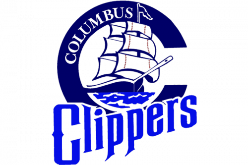
 The 1996 Columbus Clippers logo featured a ship sailing out of a large blue “C.” Stylized waves could be seen below the ship, and there was also the word “Clippers” in light blue letters.
2009 – 2010
In the following version of the Columbus Clippers logo, the clipper ship grew a good deal smaller. The large “C,” which looks entirely different now, has become part of the word “Clippers.” The word features an astounding script imitating handwriting. In an alternative logo, the clipper is sailing over the full name of the team.
2011 – Today
Colors
The palette incorporates two shades of blue (navy and light blue), which seems a perfectly natural choice for something that is connected with the ocean. Gray and white add the finishing touch.


