Coles has been known as one of the largest supermarket and retail chains in Australia. The history of the brand can be traced back to 1914, when G. J. Coles opened the Coles Variety Store in a suburb of Melbourne. Today, the company operates over 800 stores across the country (1502 including Coles and Coles Express-branded petrol stations).
Meaning and history

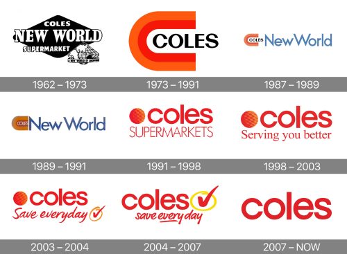
The Coles logo has undergone no fewer than ten updates. Yet, it has been loyal to the red and orange/yellow palette for much of its history.
What is Coles
Coles Supermarkets Australia Pty Ltd operates supermarkets and petrol stations across Australia. It’s one of the leaders in its segment accounting for approximately 26% of the market. It is headquartered in Melbourne and works as part of the Coles Group.
1914 – 1962
Over this period, the word “Coles” on the signage was written in various styles, so it is hardly possible to talk about a real logo.
1962 – 1973
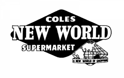
The supermarkets operated under the name of Coles New World. The logo was dominated by the wordmark, which combined three different fonts. In the background, there was a rhombus with rounded corners. In the lower right corners, there was a stylized map of the same shape. It symbolized the new world mentioned in the name of the brand. There was also an explanatory tagline “A New World of Shopping.”
1973 – 1991
We can see the lettering “New World” here, which now dominates the design. The color is a rather pale and grayish shade of blue. The type is a sans featuring plenty of acute angles and glyphs of even thickness.
1987 – 1989
This version was a major step forward. It looks by far more modern due to its simple and sleek shapes.
The emblem was reduced to the stylized “C” in red and orange. Inside the “C,” the word “Coles” could be seen. The font was an all-caps sans serif one. The glyphs combined thick and thin glyphs. They did so not in an old-fashioned way but in a dynamic style.
1989 – 1991
The blue grew somewhat darker. The stylized “C” became yellow, while the white gap inside it was now red. The lettering “Coles,” in its turn, went white.
1991 – 1998
A new era started in the history of the Coles logo.
Gone was the stylized “C,” and a simpler circle was now the emblem of the retail chain. It preserved the original palette combining red and orange, though.
The word “Coles” in a simple lowercase sans could be seen to the right. The type was rather bold and perfectly legible. What’s more, the “c,” “o,” and “e” were based on a circle of the same size as the one in the emblem. As a result, the wordmark and the emblem seamlessly merged.
Below, the word “Supermarkets” could be seen in light and narrower letters.
1998 – 2003
The company’s managers decided that there was no need for the explanatory word “Supermarkets” and replaced it with “Serving you better”.
2003 – 2004
In its turn, the “Serving you better” slogan was replaced by “Save everyday”. It was paired with a circled tick. What was special about the new type was that it made the logo more dynamic and added a casual and personal touch. That was because the tagline seemed to have been written by hand.
2004 – 2007
The red and orange circle disappeared. This looked like a natural step as two emblems in a single logo were a bit too much. The tick, in its turn, grew more prominent.
The tagline became more compact. Some space appeared between the “y” and “d” breaking down “everyday” into the grammatically correct “every day.”
2007 – present
The basic version now includes only the name of the brand.
Colors and font
The clean, fiery colors of the Coles logo have been the factor that has been making the design eye-catching. The simplicity of the typeface provides impeccable legibility.


