CNET is the name of a widely popular English-language online technology publication. The site was launched in 1994, but the publication generated most of the talk in 2023 after CNET began using artificial intelligence to write articles.
Meaning and history
CNET was founded in 1994 by Halsey Minor, one of Jeff Bezos’ first partners. Today many people think of the website solely as a portal with news and reviews of technical innovations, but in the 1990s it was much more than that.
CNET was a very big player in online media and thus contributed significantly to shaping the ecosystem we live in today. For example, in 1996, the company helped organize the Internet Advertising Bureau.
And in 1999, CNET heralded the first-ever online media site to publish a “publication policy and distribution guidelines” – ethical guidelines that distinguished between editorial and commercial content.
The CNET site became profitable as early as 1998, and its founder, Halsey Minor, left the company in February 2000.
CNET served as a launching pad of sorts for other companies. It was the starting point for many successful Internet projects.
In January 2023, it was revealed that CNET had been “secretly” publishing AI-generated articles for months. In all that time, 77 AI-generated articles were published on the site. Even though CNET did not conceal the use of AI, it went largely unnoticed for a long time.
What is CNET?
CNET is one of the leading Internet portals, dedicated to IT and computer technologies. The website was launched in the middle of the 1990s, and by today has grown into one of the most reputable platforms in its sphere.
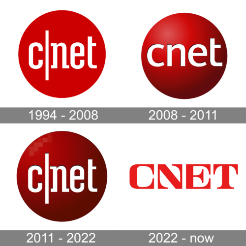
In terms of visual identity, CNET has been loyal to its original red and white color palette throughout the whole history of the website. For more than twenty years, the logo of the website has been built around a solid red circle, and only in the 2020s, it was removed from the primary icon.
1994 – 2008
The very first CNET logo, designed in 1994, stayed active for longer than a decade. It was a solid red circle with no gradients, overlapped by a white lowercase wordmark, where the “C” was separated from the “Net” by a thin vertical line, also in white. The lettering was set in a narrowed serif font.
2008 – 2011
The redesign of 2008 has added volume to the CNET logo, and introduced a three-dimensional version of the emblem, with a gradient red sphere. The white lettering was embossed on it in, set in a modern sans-serif font, with the vertical line removed. The logo stayed in use by the platform for just three years.
2011 – 2022
In 2011 CNET came back to its original logo but refined it, and made the circle more voluminous, adding dark red gradients to it. With the new shade of the background, the white lettering with the vertical line dividing it into two parts started looking brighter and more distinctive.
2022 – Today
The redesign of 2022 has introduced a completely new logo for the Internet platform. The red sphere was gone, and now the CNET badge is just the wordmark, set in red capital letters against a transparent background. The font, used for the inscription is very stylish and cool, with enlarged triangular serifs and unique contours of the first two characters.
Font and color
The bold uppercase lettering from the primary CNET logo is set in a custom designer typeface, with some of the characters reminding commercial fonts, and some — absolutely unique. The closest fonts to the one, used in this insignia, are, probably, Vinho De Amora Black, Apothicaire XBold Expanded, or HWT Aetna Regular, with significant modifications of the contours.
As for the color palette of the CNET visual identity, it is based on a bright shade of red, a color of passion and strength. In combination with white, red looks very lively and friendly.


