The Clorox Company makes and sells consumer and professional products. It is based in Oakland, California, US. It was no. 468 on the Fortune magazine’s 2018 Fortune 500 list.
Meaning and history
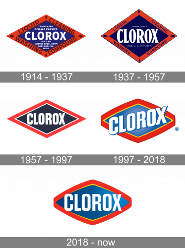
The visual brand identity consists of two logotypes: the brand’s logo and the corporate logo. At some points in the company’s history, they coincided, while at other points, they were utterly different.
Brand’s logo
1914 – 1937
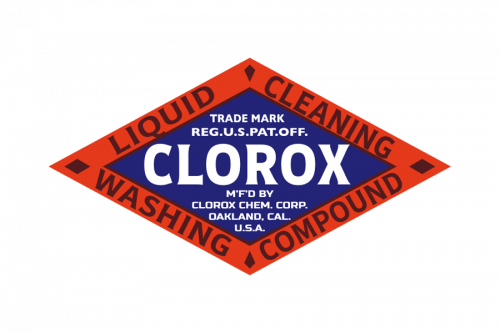
The original Clorox logo was a white rhombus with a thick black border. It was very heavy on the text and looked unbelievably cluttered. Yet, at least the name of the brand was prominent and didn’t get lost.
1937 – 1957
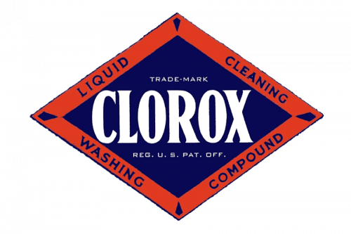
The name of the brand grew even more prominent because the text next to it became smaller.
1957 – 1997
The colors were inverted (the center grew black, while the trim grew white). All the text disappeared, except for the name of the company.
1997 – 2018
The design grew vivid due to the colors. Also, it became dynamic due to the “ribbon” trim and the wordmark directed upward.
2018 – Today
The wordmark was again directed horizontally, which provided better legibility.
Corporate logo
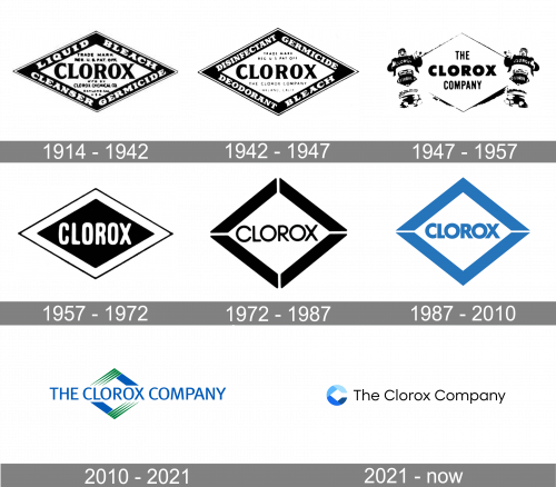
From 1914 to 1942, the company typically used the same emblem as the brand. They stopped sharing the same logo in 1947.
1914 – 1942
1942 – 1947
1947 – 1957
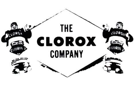
The rhombus shape remained the basis of the emblem but it now looked simpler. The text, which cluttered the old versions, was replaced by “The Clorox Company.” The rhombus was white with a thin black border.
From both sides of the rhombus, stylized creatures could be seen. While we cannot exactly name their biological species, we can refer to them by function – “germs and dirt busters.”
1957 – 1972
At this point, the company decided to return to the old scheme when the brand’s logo was the same as the corporate one. The company adopted a solid black rhombus logo with a thick white border and a thin black trim. There was the name of the brand in a simple sans with softly rounded ends. This was a very clean design.
1972 – 1987
Once again, the company stopped sharing the logo with the brand.
In the new corporate logo, the colors were inverted. The central part of the rhombus grew white, while the trim was black. White gaps appeared at each angle, which created an “open” effect.
The proportions of the rhombus slightly changed – its width and height grew closer. To fit the new proportions, a new type was introduced. It was lighter and wider.
1987 – 2010
The designers replaced black with blue making the emblem lighter. The blue also added the “clean” message as blue is the color of the water.
The gaps on the top and lower parts of the emblem were closed. The type grew bolder and now better fitted the bold trim.
2010 – 2021
The Clorox logo was redrawn. Two of the rhombus sides were replaced by a dynamic stripe pattern in green. At the forefront, there was the lettering “The Clorox Company” in blue. The type grew lighter. There were no more “squeezed” glyphs because the wordmark now took up more space.
2021 – Today
Font
Both the logos feature an unpretentious sans serif type providing decent legibility. Yet, in the case of the brand’s logo, the type is narrower and bolder than in the corporate logo.
Colors
The corporate Clorox logo relies on the combination of blue and green. The most obvious message behind these colors is “clean” (blue is the color of the water and sky) and “natural” (green is the color of the leaves and grass). The message perfectly fits the image the company wants to create.
The combination of colors in the brand’s logo also includes blue as the “clean” color. There is also red as the color of energy and strength. If the palette could speak, it would say “cleans powerfully.” Such a message does a good job representing the core promise of the product.


