Clif Bar is a good company from the United States, which was established at the beginning of the 1990s with the idea of producing organic bars and drinks. Today the brand is one of the most popular in its segment and distributed its products on all the continents.
Meaning and history
???? – Today
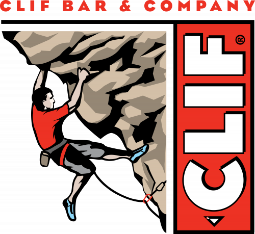
The visual identity of the organic foods company from the USA is ornate and rec-ognizable. It is composed of a very detailed image with a bold and bright inscription part on its right.
The image depicts a man climbing a rock or a cliff. The color palette of the graphical part consists of several shades of brown for the rock, and red with black for the man’s uniform.
The vertical red rectangle framed in black contains a bold white “Clif” lettering in all capitals. In the bottom part of the rectangle, there is a small white triangle pointing down.
Another wordmark, “Clif Bar & Company” in red capitals, is placed above the emblem and executed in a stylish and sharp sans-serif typeface with thick letter lines and distinct cuts.
The Clif Bar logo is a representation of man’s power and a healthy way of life. It also shows the brand as a strong and professional one, evoking a sense of expertise and high quality.


