 Cleveland State Vikings Logo PNG
Cleveland State Vikings are the name of an athletic program from Cleveland State University, which was established in 1965, and is based in Cleveland, Ohio. The program is composed of 17 men’s and women’s teams, which are all part of Division I of the NCAA.
Meaning and history
Since 1972, the Cleveland State Vikings have been a part of the first division of the National Collegiate Athletic association, even though in the beginning they played there as the Fenn College Foxes (the previous name of the university). The teams of the program are also members of the Horizon League, with some of the teams competing in the Mid-American Conference, and some — in the ASUN Conference.
What are Cleveland State Vikings?
Cleveland State Vikings is a collegiate athletic program of Cleveland State University, which consists of 17 men’s and women’s teams, which compete in various sports disciplines, including Wrestling, Fencing, Cross Country, Lacrosse, Basketball, and others.
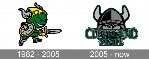
As for the visual identity, the Cleveland State Vikings teams have progressed a lot, starting with a funny caricature of a mean creature, and finishing with a professional badge, evoking a sense of strength and confidence. The color palette of the badge has also been enhanced, with the shades getting darker and deeper, from the bright and vivid scheme of the logo from the 1980s to the powerful intense mix of the 2000s.
1982 – 2005
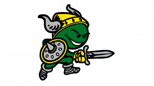
The Cleveland State Vikings logo, designed in 1982, featured a cool caricature of a Viking, with a green face and body, wearing a horned helmet, and carrying a rounded shield and a sharp sword. The creature looked very mean and tricky, like saying “you better not even try”. All the elements apart from the Viking himself were drawn in a light-gray and yellow color palette, with a medium-weight black outline. There was no lettering or even abbreviation on this badge. The bright green Viking stayed with the athletic program of Cleveland State University for almost two decades, which is pretty impressive.
2006 – Today
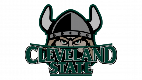
The redesign of 2006 fully rethought the Knights logo, and introduced a new powerful version, with the Viking portrait overlapped by a dark two-leveled logotype. The portrait was executed in a muted and deep color palette, with the hair of the warrior in beige, his helmet in black and two shades of gray, and all the elements outlined in thick black.
As for the lettering, set in the dark green color, it was executed in all capitals of a sleek and modern typeface with the serifs of the bottom lines sharp and slightly curved, and the ones on the upper ends — bolder and more square. The top border of the lettering was a bit arched from the center, while the bottom one was completely straight. The inscription was enclosed between two horizontal green lines — the arched on the top and then square at the bottom.


