CJ Entertainment is the name of a video-production company, established in Seoul in the middle of the 1990s, and named after its founder, Cheil Jedang (CJ). Today the company is a part of a bigger brand, which also includes a publishing house and investment division.
Meaning and history
CJ Entertainment is a very well-known and reputable player in the South Korean market of film production. The company has produced and released dozen La of movies, as well as was working closely with such international giants as Paramount Pictures, being their representatives on the Asian market.
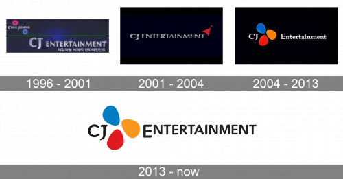
In terms of visual identity, the company has always chosen a simple and strict style, which showed it from the professional side and emphasized its confidence and expertise.
1996 – 2001
The very first badge for CJ Entertainment was introduced in 1996 and featured a traditional “cinematographic” design, the one that looks professional on the screen and makes you remember the name. It was a deep blue gradient background with the delicate white “Cheil Jedang” name written in the upper left corner, decorated by two bold rings in pink and blue, a thin green horizontal line and a three-dimensional glossy “CJ Entertainment” logotype is metallic matte, with a blinking star on top of the last letter. The whole badge had a tagline in Korean.
2001 – 2004
The redesign of 2001 made to logo stricter and stronger, by switching the color palette to black, silver, and red, and removing all the extra elements. The new badge was composed of glossy silver lettering, placed in the center of a solid black badge, and accompanied by an abstract red figurine, which was “flying away and up” the last letter of the uppercase wordmark.
2004 – 2013
In 2004 the CJ Entertainer visual identity was refreshed again, with the logotype rewritten in white, the typeface switched to a modern yet elegant and bold serif, and the graphical element redrawn and moved inside the inscription. Now the colorful emblem, set between the “CJ” and “Entertainment” parts of the logotype, was formed by three smooth petals — in blue, orange, and red. The petals had a slight gradient and glossy surface, which added volume to the whole badge.
2013 – Today
The redesign of 2013 kept the style of the emblem from the previous version, but reversed the colors and changed the typeface of the logotype. The emblem itself was redrawn too, in a flat manner, and with softer and a bit muted shades. The new logotype is set in all capitals of a bold and sleek typeface; with the “J” in the first part having serifs, and all the other letters in the wordmark straight and geometric. The contours of all symbols are clean and smooth, and only the “A” has it opened. Also, the whole inscription is set in the uppercase, but the first “E” in the “Entertainment” is slightly enlarged.


