

![]() Chips Ahoy! Logo PNG
Chips Ahoy! Logo PNG
Chips Ahoy! is a brand of cookies with chocolate chips. Approximately 58% of the total sales of the brand can be attributed to the original Chips Ahoy! product. The brand kept coming up with new ideas and released a range of flavors. Additionally, they periodically introduce limited-edition and special-edition tastes to keep things interesting and fresh, so there’s always something new to look forward to.
Meaning and History
![]()
Nabisco invented Chips Ahoy! in 1963. Although manufactured in large quantities, the cookies were initially marketed as having the same flavor as homemade ones. “Chips Ahoy!” has a nautical vibe to it. With a play on words, the brand signaled a sea of chocolate chips in every bite, taking inspiration from the nautical cry “Ships Ahoy!” With 232.6 million units sold (2017), Nabisco Chips Ahoy rose to the third spot among American cookie brands.
What is Chips Ahoy?
Chips Ahoy! cookies have been beloved for generations. The Chips Ahoy! cookies are extensively distributed in North America, Europe, Asia, and Latin America.
1963 – 1975
![]()
The Chips Ahoy! packages have always featured a cursive-style inscription with transitional serifs. In the original logo, the inscription is stacked with the top line slightly overlapping the bottom one. It is also printed on a slight diagonal, which gives the logo a feeling of movement and excitement. The name is done in white which contrasted well against the dark blue background. It was accompanied by a wavy yellow line that said “Chocolate Chip Cookies”. A basic sans-serif font allows the focus to stay on the name.
1975 – 1979
![]()
In the 1970s, the company made all the lines straight. The name features a bolder and at the same time more sophisticated inscription. It was achieved through the use of high-stroke contrast and beautifully rounded stroke ends in combination with hairline serifs.
1979 – 1991
![]()
The logo still consists of the same elements and looks recognizable. However, there are no decorative curves as they have been replaced by serifs. Such an update created an image of a strong and confident brand. It also added the word “Pure” to the “Chocolate Chip Cookies” line, making it white and underlined to ensure that it catches attention.
1991 – 2000
![]()
There were no major changes to the font besides the fact that all the letters were italicized. The designers set dark blue letters on a white background. They added an outline as well as a shadow to make the inscription stand out on any background. Several curved lines around the exclamation mark made it seem that the name was echoed far and showed the extensive reach of the brand. The darker color of the logo gave it a very professional appearance.
2000 – 2001
![]()
Although this logo was not used even for a year, it gave birth to a completely new logo era for the brand. It features a sans-serif font that has an illusion of volume thanks to highlights on one side. The name is printed on a curve, similar to the original version but in one line. They kept the white background but made the shadow a bright red color, which reflected the consumers’ passion for the cookies and the joy they brought. The “Real Chocolate Chip Cookies” tagline is also done in a different style, but it is quite small to attract attention.
2001 – 2010
![]()
It was soon decided to create a more compact logo. The designers simply played with the earlier version, adjusting only minor details. The result was a powerful, attention-grabbing, and memorable visual identity for the brand.
2010 – Today
![]()
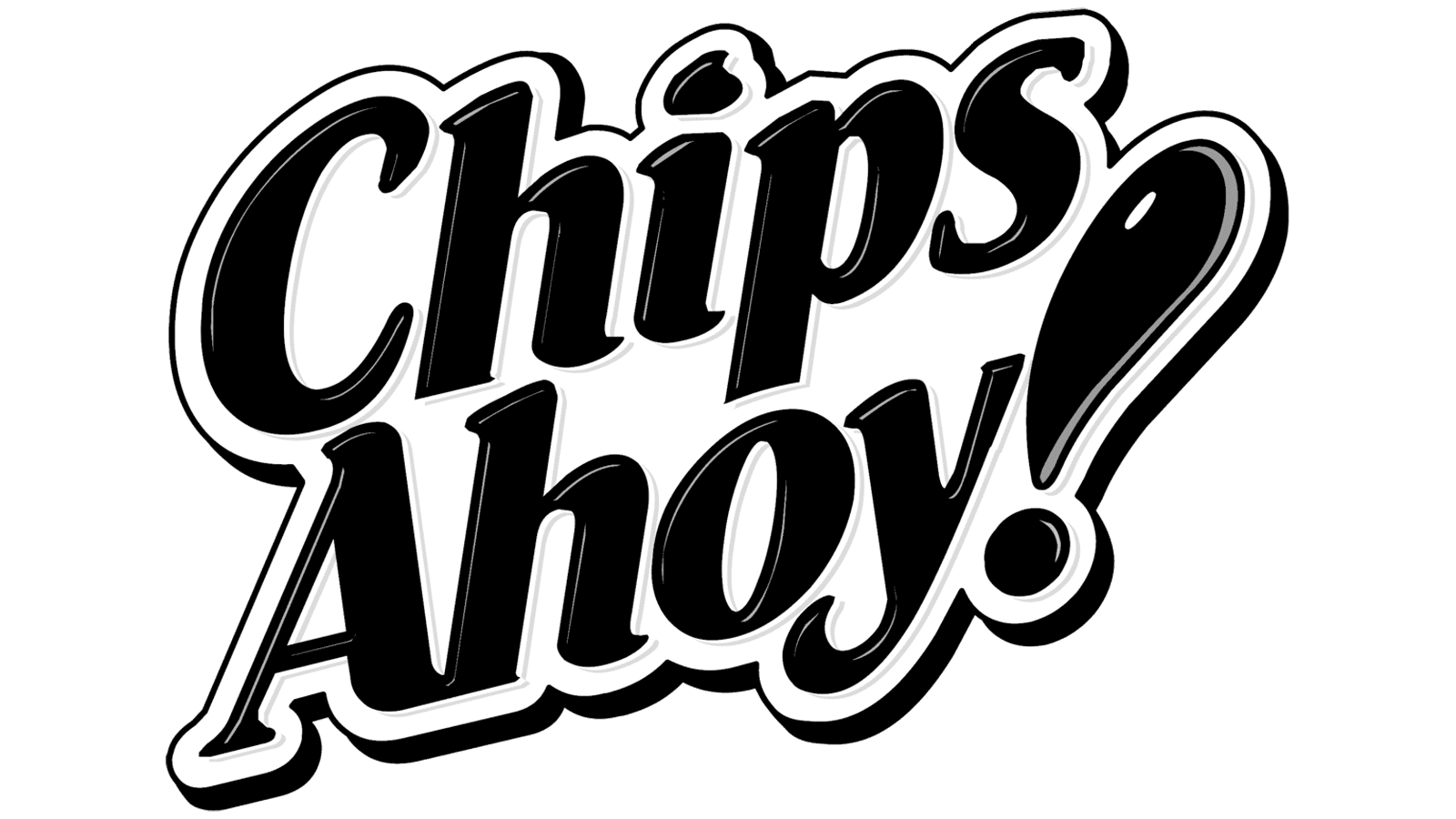
This logo update further modified the existing version. Instead of using red for the shadow, it was featured in the exclamation mark, which created a far more impressive effect. The blue color was made lighter to create a brand image that is more suitable for fun and tasty cookies rather than a more conservative company. To make the emblem even friendlier, the designers placed the letters unevenly to create a round shape that would remind of round cookies.
Font and Color
For many years, the company’s main colors were blue and white with a bit of yellow. It created an image of a trustworthy brand while adding fun notes to show that its products are also enjoyed by a younger population. At the beginning of the new century, they added a red and removed the yellow. Such a color palette was more powerful and eye-catching. The company tried to stay relevant to all the generations, while not losing its identity formed over the years.
As for the font, the company initially went for a serif font for its name that also featured high-contrast strokes and elegant curves. In the original version, it closely resembles the Worldwide Bold Italic font. In the 80s, it was a serif font that looked like Garamond Std Ultra font. All the other versions are custom modifications of similar fonts. For the tagline, most logos used a basic, bold font without serifs.


